This is a continuation of weather prediction via ML and is the final part (2/2) where I demonstrate how to write Python code to leverage a neural network algorithm called Neural Prophet, a quite straight-forward and useful model. Be sure to read the first part that focuses on understanding the data in Excel and some data crunching we can do there first in Part 1: https://flyingsalmon.net/?p=3920
The data set I used is exactly the same as used with Excel in Part 1 of this blog. The process is quite different however in this method. We need several libraries to accomplish this in Python, namely: neuralprophet (for machine learning), pandas (for data frames and dataset manipulations), matplotlib (for plotting), and optionally pickle (for saving the model to disk). Neural Prophet is a time-series model, inspired by Facebook Prophet and AR-Net, built on PyTorch. For documentation, see https://neuralprophet.com/html/index.html
I cleaned up the data as usual albeit using Python methods, then I train the machine with clean data with a subset covering 50 years (so, 1967 to 2017 as the dataset goes up to 2017). neuralprophet specifically requires two and only two columns: ds (for date-time series) and y (for known values…in this case, temperatures). Because of this, we have to use either High or Low temperature columns from the dataset…a a time. I chose to use high temp (TMAX) column. If I wanted to predict the low temps, I would then use TMIN column, but the process is exactly the same so I won’t repeat that here. I’ll demonstrate how to do it using TMAX.
After training is complete, we get to see the MAE values which is Mean Absolute Error.
Next, I let the machine predict by specifying how many periods to predict for. Since my frequency parameter is set to days unit, the period I specify will be interpreted as days. For 180 periods would mean 6 months into the future from the last known data in the dataset (e.g. Dec 2017+6 months), and so on. I will predict for 1800 periods…meaning, about 5 years into the future from 2017. The predicted values appear as ŷ (y-hat), which is the predicted value of y (the dependent variable) in a regression equation.
Then I plot the model’s predicted values (high temperatures) and show in different plots for different perspectives. Finally, and optionally, I save the model into a binary file that can be loaded later for additional tuning and predictions without having to rerun the model from scratch.
That’s the overview entire process flow. Next, I’ll walk you through the process in more detail along with the outputs along the way.
After you have successfully installed the required ML library as follows
pip install neuralprophetIt’s time to import the additional libraries:
import pandas as pd
from neuralprophet import NeuralProphet
from matplotlib import pyplot as plt
import pickle
I define a variable (actually a pseudo constant as there’s no true constant in Python) for my dataset:
DATASET = '<yourpath>\\seattleWeather_1948-2017.xlsx'Next, I read it and get some basic info about the dataset:
df=pd.read_excel(DATASET)
df.info
The output looks correct:
<bound method DataFrame.info of             DATE  PRCP  TMAX  TMIN  RAIN
0     1948-01-01  0.47    51    42   1.0
1     1948-01-02  0.59    45    36   1.0
2     1948-01-03  0.42    45    35   1.0
3     1948-01-04  0.31    45    34   1.0
4     1948-01-05  0.17    45    32   1.0
...          ...   ...   ...   ...   ...
25546 2017-12-10  0.00    49    34   0.0
25547 2017-12-11  0.00    49    29   0.0
25548 2017-12-12  0.00    46    32   0.0
25549 2017-12-13  0.00    48    34   0.0
25550 2017-12-14  0.00    50    36   0.0

[25551 rows x 5 columns]>
with .types() method, we can also check the data types of each column:
DATE    datetime64[ns]
PRCP           float64
TMAX             int64
TMIN             int64
RAIN           float64
dtype: object
We see DATE column is a datetime object which is exactly what we need as Neural Prophet only takes a datetime object type.
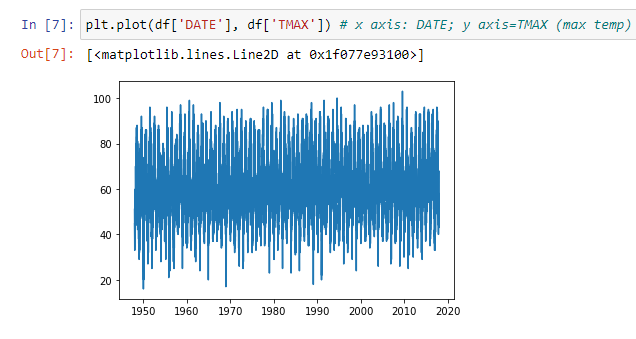
We can chart our known data and get a good visual.
We can eliminate the missing data rows as not to affect the calculations, and then rename the cleaned-up version to ds (for date) and y (for prediction value) columns as below:
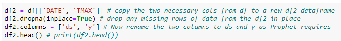
After cleaning up and renaming the columns, if we print the df2 dataframe’s first 5 rows, we get this:
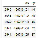
Our data is in a shape that’s ready for machine training! We start the training below with the code and progress shown:
The output from the algorithm may look like this after training has finished:
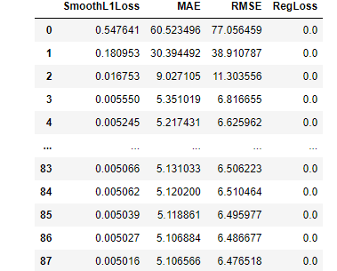
We see the Mean Absolute Error in MAE column…as you can see the errors started with 60°+ error margin! Then eventually plummeted to about 5° within 100 epochs. In this case, 5.1 degrees of error (+/-) is pretty good considering unlimited prediction using 50 years of daily temperature data.
Now that the machine is trained, we get to the fun and ultimate step— prediction!
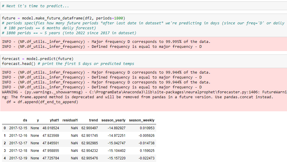
As you can see, I’m predicting for 1800 periods which is at frequency of days, therefore, for 5 years into the future. We can ignore some of the warnings for now. The last table above shows a snippet of the predicted values. By convention, the predicted values are in y-hat column (yaht1 in this output). Using pandas, I saved the predicted values into an Excel sheet so I can sort, filter etc.
The summary of the output from the exported predictions, are summarized below:
Max. High temp (predicted) for jan, 2022: 53
Min. High temp (predicted) for jan, 2022: 50
Avg. High temp (predicted) for all jan, 2022: 51
Max. High temp (predicted) for july, 2022: 83
Min. High temp (predicted) for july, 2022: 78
Avg. High temp (predicted) for all july, 2022: 80
Actual Avg. January high temp was :45°
Actual Avg. July high temp (to-date, we’re around the middle of July at the time of writing) seems to leaning toward: 80°
This was impressive! Didn’t take very long to predict years of daily temperatures based on some training data which only took a few minutes and the code isn’t too terrible either!
We can also do additional useful plotting on the predicted values using matplotlib as shown below:
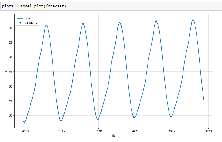
We can clearly see the high and low temperature ranges across the seasons and years (remember: all values are daily, and in fahrenheit).
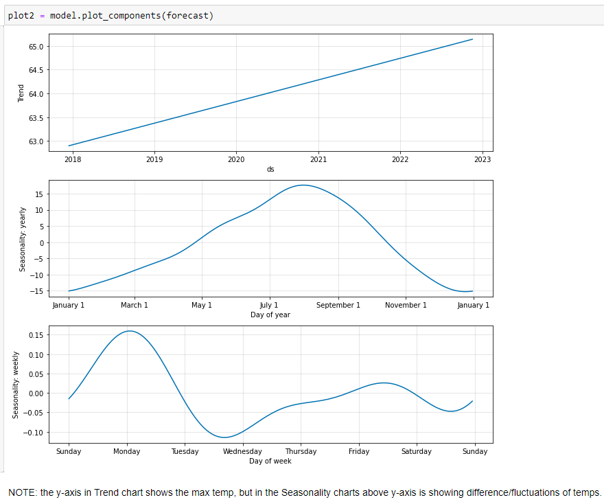
The high temp prediction is on upward trend. Month by month fluctuations are shown in 2nd plot, and weekly trends are shown in the 3rd plot. For some strange reason, Mondays seem to be warmer and tuesday nights to early wednesdays the coolest in Seattle!
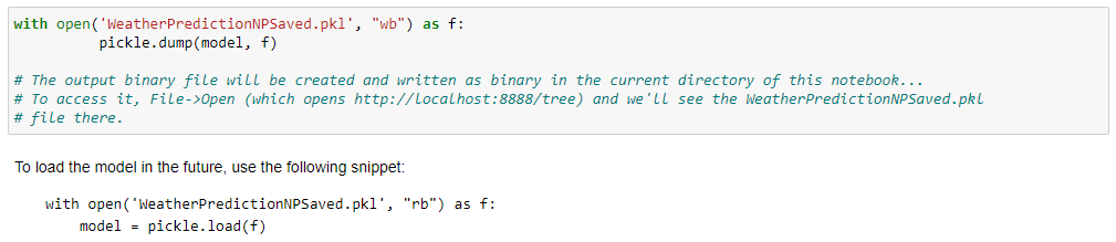
Finally, to persist the model on a disk, the following code does the magic; as well as the code to load it at a later time.
My GitHub repository and full source code for this solution is posted at: https://github.com/flyingsalmon/NeuralProphet
You can check out my other repositories on GitHub: https://github.com/flyingsalmon/
As you can see both this model and Excel did a pretty good job at predicting. While they’re not exactly the same, they both have their significance and value. If you know both methods, you’re best equipped to tackle such predictions and compare them very meaningfully for numerous scenarios. I hope this was interesting and helpful!
▛Interested in creating programmable, cool electronic gadgets? Give my newest book on Arduino a try: Hello Arduino!
▟