Venn diagrams are best used to show overlapping or interconnected relationships, especially overlapping segments. While they are ubiquitous, very few diagrams actually update automatically when data changes…that’s because most of them are one-time illustrations with no ties to the underlying data…they’re just drawn up like Infographics. It doesn’t have to be that way! In this blog, I show you the right way to draw Basic Venn, and Stacked Venn (aka Onion charts) diagrams with real-time link to underlying dataset.
In this post, I’ll create different types of charts using slightly different types of data and point out their usages.
The first thing we need to do is apply Venn to the right type of data. Sure, you can theoretically depict any sort of data, but that won’t be very meaningful. For example, I have collected data on: Obesity, High blood-pressure (BP), and Diabetes across the USA. After scouring several sites, and then connecting the data with some reports, I found the percentages of people who have either of those diseases only (note: obesity is now classified as a disease and not a symptom in the USA), those who have combinations of them, and people who have all of them. Using the figures, I was able to derive concise percentages and counts for each combination. I won’t go into that data culling and the arithmetic part, instead I’ll focus on creating meaningful Venn diagrams out of the data.
diabetesresearch.org, wikipedia.org
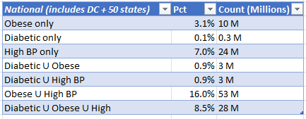
The numbers are pretty close to actual numbers (I did round off here and there) up to 2020. The U (union) sign indicates AND, meaning Diabetic U Obese row is for those people who are both Diabetic and Obese.
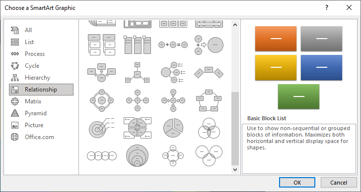
Venn is a perfect diagram to depict this dataset. In Excel, we start by inserting a SmartArt object called Basic Venn. The steps are shown below:
Once we have an empty list of the object, we start entering the labels: Obesity, High BP, Diabetes. Excel already created the intersections/overlapping segments for us (although they are not quantified yet) and does the color transparency well by default. I have customized it later, but that’s optional.
Now that we have the dataset (which is the most crucial part really), the next part is to tie that dataset to this diagram such that once it’s set up, we don’t have to edit the chart at all, we just update the data table as needed. To do that, we insert a textbox and apply a simple cell reference as a formula. This will be illustrated below as to how they tie together in the later example. This text box will contain the link to a datacell, in this example case, I already have the percentage of US population with Obesity, High BP, Diabetes as well as the actul number of people (expressed in millions) in the data table…so I link the content of the textbox to the appropriate cell. To keep the diagrams clean, I create two separate charts: one showing in percentage (Venn 1), another showing in count of millions (Venn 2).
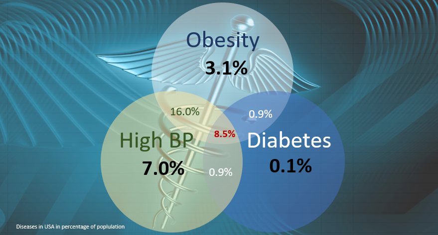
The chart shows that Obesity and high blood-pressure are tightly related resulting in 16% of people having both (more than just having one or the other disease alone). About half of that population (who are obese and have high BP) also have diabetes…this means 8.5% of population suffer from obesity AND high BP AND Diabetes! The percentage of people who have only high BP (and not the other 2 diseases) is 7%. However, the percent of people who have high BP AND Obesity are 16%. Similarly, people with Diabetes AND high HP are 0.9% of the population. So you can see how powerful this Venn diagram can be in explaining these facts.
What do these percentages mean in terms of numbers? That’s shown in the next diagram Venn 2.
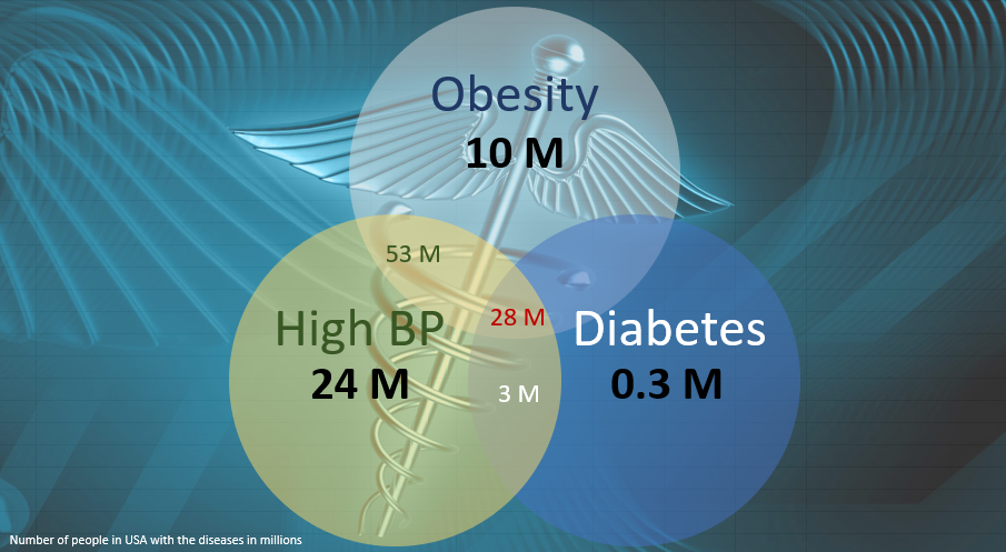
This also concurs that Obesity and high BP are tightly related resulting in 53 million Americans having both! That is more than just having one or the other disease alone. People who are obese and have high BP and diabetic (that is, they suffer from all 3) are at 28 million people! (NOTE: diabetic data here is for Type 2 diabetes).
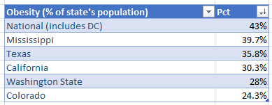
Great! I’ll show you more examples of Venn diagrams with more instructions, but I want to also share some data I collected on these diseases by State, so I can compare them to national level figures. The final data is summarized in a table below (I’m just sharing Obesity data in this example):
Now you may be tempted to use Venn diagram on this again, and you could use a Stacked Venn for this, but I think a bubble chart is a better candidate for this type of data because each bubble size will be proportional to the percentage amount, and if we lay out the bubbles side by side we can easily see their relative size differences. Better yet, bubble chart can also show us trend! For example, we can configure the Y-axis to also show the bubble’s magnitude (percentage in this example) so the higher up a bubble is positioned, we can clearly attest it has higher value. Now if we sort the Pct column in DESC, and then add the data series in with size and y-axis value for each, then we have a perfect bubble chart as below:
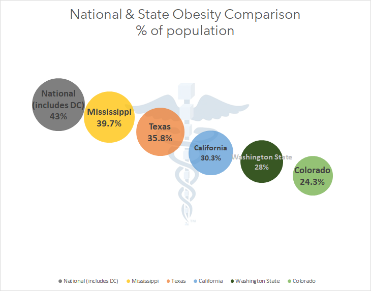
The chart clearly shows nationally 43% of US population is classified as obese. Colorado (lower y-axis, smallest bubble) has the lowest obesity in the nation (24.3% of Colorado folks are obese), whereas Mississippi has the highest percentage for any one state.
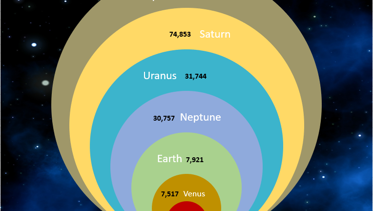
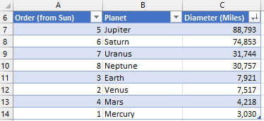
Scary stuff! Let’s get back to Venn diagram…this time, I’ll demonstrate a Stacked Venn diagram. It’s aka Onion chart because it typically has multiple gradually increasing/decreasing layers. I have the following data on planet sizes from our solar system:
An Onion chart would be perfect to visualize this dataset. The final chart is shown below (your chart will look different out the gate but that’s because I did some customization, which you can explore on your own as desired):
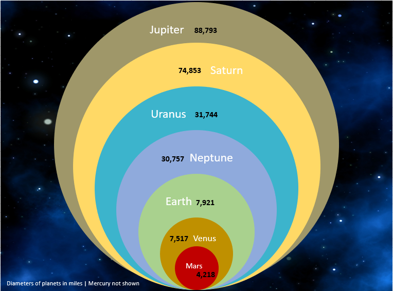
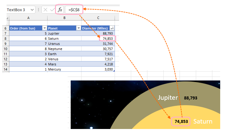
The planet sizes are palpable in this diagram. The diameter figures come directly into text boxes for each ring from the data table above. NOTE: Mercury is now shown here because there’s a limit to the number of elements in this type of chart (and because it’s relatively very small, we might as well add a dot instead for it). I alluded to linking textboxes in the charts to the data table or dataset but how do you do it? The following picture demonstrates that…you add a formula to point to the cell reference containing real data, instead of typing in the value directly into the textbox. That way, you only need to enter/edit the data in the table and chart will update, and you’ll never have to edit the chart manually.
Note that PowerPoint and Word (and any Office suite application that support SmartArt) also can help you create Venn diagrams, however, the actual linking to the underlying data this way can only be done in Excel. I hope this helpful to you. For more charts, challenges, tips in Excel domain, search for “excel” from my main page or click on the Word Cloud containing “Excel”. Enjoy!
▛
Interested in creating programmable, cool electronic gadgets? Give my newest book on Arduino a try: Hello Arduino!