Here’s the scenario:
We have two players named Eve and Inna in a game competition (say, Tennis). They play 5 matches against each other, and each match is composed of 3 games called Sets.
We have data on scores of the players set by set for all 5 matches.
So, the question is: How do we present this data, and then determine the winner of each Set, each Match, and the overall Competition? Then how do we create visualizations for all that?
In this blog, I walk you through the steps from start to finish. Follow along, and then create your own variations!
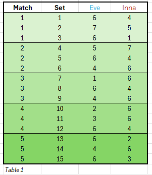
First, we tabulate the scores for each Set and Match as below (Table 1).
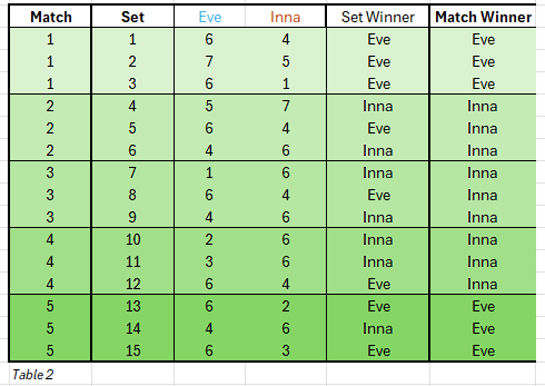
Next, we can add 2 new columns: Set Winner, and Match Winner for each game played.
However, we are NOT going to just manually enter the names (which is error-prone and not scalable to many games), instead we’ll use formula to determine the winner and put the exact name from the column headers accordingly.
We can do this using: IF(SUM). For example: =IF(C25>D25,$C$24,$D$24) will give us the Set winner’s name for a specific game (row). In this example, C25 is Eve’s score for Set 1, and D25 is Inna’s score for the set, C24 contains player 1’s name (Eve), D24 contains player 2’s name (Inna).
By extending this formula to all the rows in the column Set Winner, we fill in automatically the Set Winner column with the winner’s name for all sets.
Now, we need to fill in the Match Winner column with the match winner’s names.
For this, we use SUM and nest it within IF as IF(SUM) because the sum of the 3 sets’ scores will give us the match winner’s name. Example: IF(SUM($C$25:$C$27)>SUM($D$25:$D$27),$C$24,$D$24)
The results are tabulated below (Table 2).
Now we’re in a position to count the Sets and Matches won by each player using =COUNTIF(). Example: =COUNTIF($E$25:$E$39, $C$24) to get Eve’s total Set wins. And =COUNTIF($E$25:$E$39, $D$24) to get Inna’s Set wins.
Similarly, we can get Match wins for each user by: =COUNTIF($G$25:$G$39, $C$24) and =COUNTIF($G$25:$G$39, $D$24). Notice that we’re applying COUNTIF() in the full data range but on Set Winner column for set wins, and Match Winner column for match wins.
So, we get the results:
Sets won by : Eve
Sets won by : Inna
Matches won by : Eve
Matches won by : Inna
Finally (before we move onto creating visualizations), we can show who won the entire competition by comparing the Matches won by simply using =IF($B$44>$B$46,$C$24,$D$24) where B44 has Matches won by Eve, B46 has Matches won by Inna, and C24, D24 contain name Eve, Inna respectively.
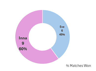
Overall winner (best of 5 matches/15 sets): Inna
At this point we have all the data we need computed and organized in order to create some visualizations!
Indeed, we can create some charts to show wins/losses by each player for each Set and Match from the tables data above.
Here are 2 column charts:
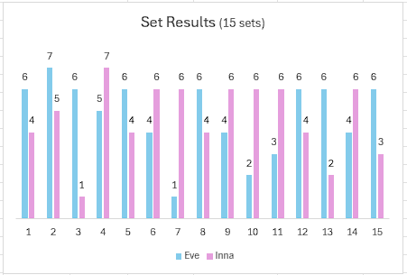
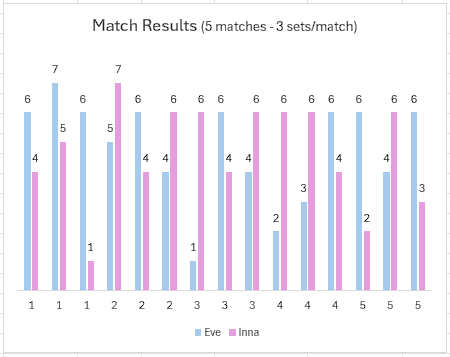
The Match Results chart also shows the Set results within the Matches 1 to 5.
We can also show trends using Line charts (e.g. did Eve start out hot and then peter out near the end, or the middle of the matches, or…etc.).
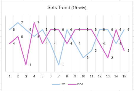
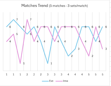
The Matches Trend chart also shows the Set trends within the Matches 1 to 5.
We can show the Matches won by each player in a pie chart as a doughnut.
Our next challenge is: How can we show the winner names (calculated automatically) visually for each Game and Match by player’s names? We want to show it as cleanly as possible in a chart, without the audience having to look at all the numbers and without having to count to figure out who won the most. For that, we’ll leverage Pivot charts. We’ll create a pivot chart based on Set number and Set Winner names; and another pivot chart based on Match number and Match Winner names. Since we have 3 sets per match, and 5 matches, we’ll have a total of 15 sets or games.
We can show the results in a nicely color-coded pivot chart as below:
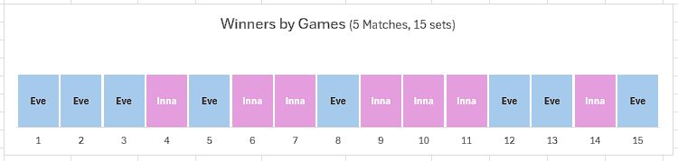
This is a quick and interactive way to see who won which set or game. I used some fine-tuning on showing the category name on each game tile and various other customizations to make it look clean.
Similarly, we can show the Match stats as below:
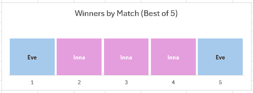
This is a quick and interactive way to see who won which match overall.
You have noticed that I said interactive for the pivot charts. I said this because we are given (by default Pivot chart controls) drop-down lists from where we can choose either player’s names (Category) or Set or Match numbers. You could choose to keep those if you want users to select/filter that way. For the following, I removed those default controls to keep the charts very tidy, but that’s your choice.
Now you know how to start with more complex score tabs and turn them into practical, tidy visualizations. This is just one of the methods I described, you could create other types of visualizations in Excel, and even more in PowerBI.