Let’s say you have some actual measurements of some parameter over time or a series, and you’re measuring it to see if it falls within the “safe” or “ideal” range. How can you create a visualization to show both the measurements and the safe/idea range values effectively?
That’s what I’m going to answer in this blog and I’ll show you several different types of visualizations that are all very effective in conveying the meaning.
Suppose we are measuring a freshware aquarium water’s pH. We start of by two columns: Date and pH. On each date (say, you record it weekly) you enter the date in Date column, and that day’s pH measure. You want to chart the pH history over time and show a chart to show how close or off the pH readings are from the ideal pH numbers which is a range. You know that the minimum ideal value of pH is 6.5, for the type of creatures you have in the aquarium, and the upper limit is 8.0. In order to show the ranges, you need to enter those values in two additional columns (one for minimum, one for maxium values). Then you can create: 1) a Scatter chart with lines and markers or 2) Stock chart using high-low-close paradigm or 3) Combo chart with stacked columns and a line or 4) Combo chart with stacked columns and markers with no line.
Each chart example is shown below.
Scatter: 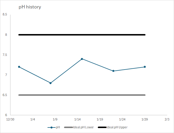
Stock: 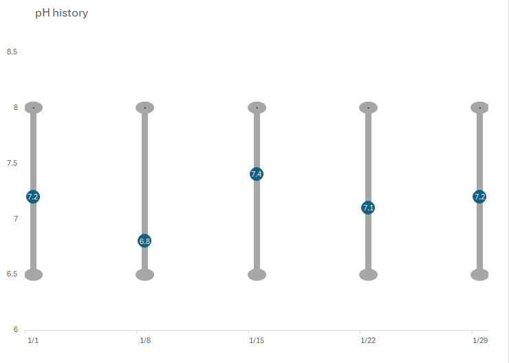
Combo: 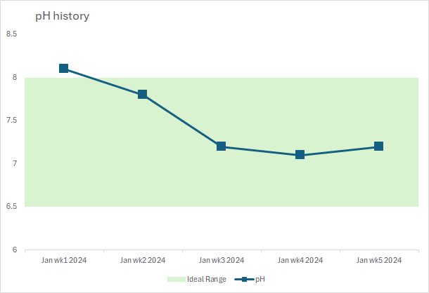
Next, I present a more complex combo chart that shows multiple classifications within a parameter. In the following example, suppose we have measured TDS in ppm units of different water bodies. The data points are shown as markers within each water body, and each source has multiple categories (Poor, Fair, Good, Excellent) and it clearly shows where our TDS measurement falls for each water source as red diamonds.
Combo II: 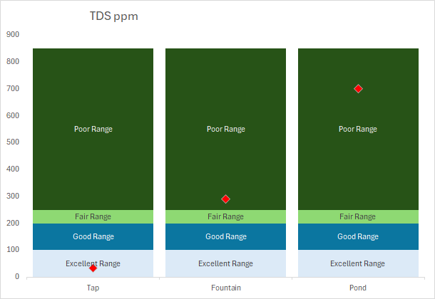
Which one you should is totally up to you as I think any of the above charts will do. You can further fine-tune it such as adding or removing data values to each data point along the marker, marker and line styles and colors, etc. However, one thing to keep in mind that the Combo chart as shown above will NOT work if the Date column is in true Date data type and will only work if it’s a generic text instead…this is due to a bug in Excel (verified that bug exists even in the latest version of O365, Jan 2024) where it won’t reduce the gap between clustered columns to zero, which is necessary to create the filled range area, if the x-axis is Date type. The workaround is to change the data type or enter the dates in another format so Excel doesn’t automatically consider it as Date values.
Stacked Bar Chart + Combo Scatter:
And finally, here’s a stacked bar chart that shows a measurement (say, your score/value), a good or normal range, and ranges of “too low” and “too high”. This form is useful for medical charts.
Suppose we have this dataset showing the normal range (say, 65-99) and actual measurement or a patient’s value is 99. You want to show a chart to the patient is a user-friendly way on a single bar chart.

I used a stacked bar chart so that each segment can be appended to the previous segment, and the values therefore need to be adjust to be sensible with the x-axis as stacked bar values would be cumulative, and to show the actual measurement, I used a scatter XY plot on a secondary plot with a custom custom marker. But first, I had to set up the data in the proper way as shown below (you’ll notice that the values all match up with the original dataset shown above):

The final chart looks like this:

Of course, you could add data labels for the segments if you like, but it neatly shows the good/normal range (green segment), and where the patient’s measurement is in relation to that, and the yellow segments on either side are too low and too high…you can modify those segment colors as desired.
Hope you enjoyed these tips!
▛Interested in creating programmable, cool electronic gadgets? Give my newest book on Arduino a try: Hello Arduino!
▟