BONUS VERSION Added on July 2, 2024 on a Euro 2024 game at end of the post.
Recently, while following the thrilling Premier League soccer (European football) matches, I came across an eye-catching visual representation of the day’s game scores and timelines on BBC Sports. The post appeared as follows (on my mobile app):
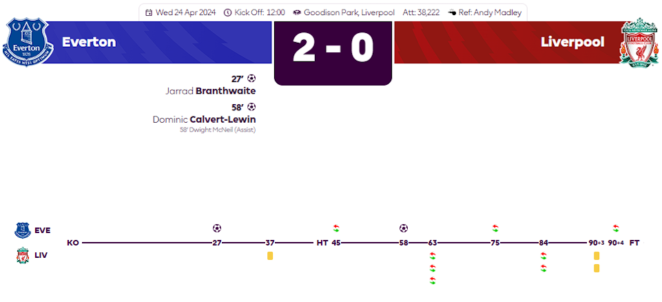
It’s both beautiful, elegant and conveys the key events of the game without overwhelming the viewer with too much other details. That got me thinking…can this be done in Excel? Could it have been done in Excel? I don’t know for sure the answer to the latter question but I can surely verify the veracity of the first one by trying it out myself.
But why Excel, when this could be done beautifully in PowerPoint, Vision, and many other illustration or presentation tools designed for infographics? Because, I want things scalable, modular, reusable! I want a design where I can plug in the data specific to a game, and BOOM! the whole chart takes shape with minimal changes. The only changes would be to enter the data for each game in the table, which is easy. And after the foundational chart takes shape, only thing to change would be a little graphics for the team logos and such (which are optional, but adds a nice touch to the text labels). The other illustration tools I mentioned don’t have the datasource paradigm behind and therefore requires about same amount of effort in creating a new game timeline, whereas with my design, the new effort decreases each time making it far more cost/time effective.
This is my version, created 100% in Excel (Office 365):
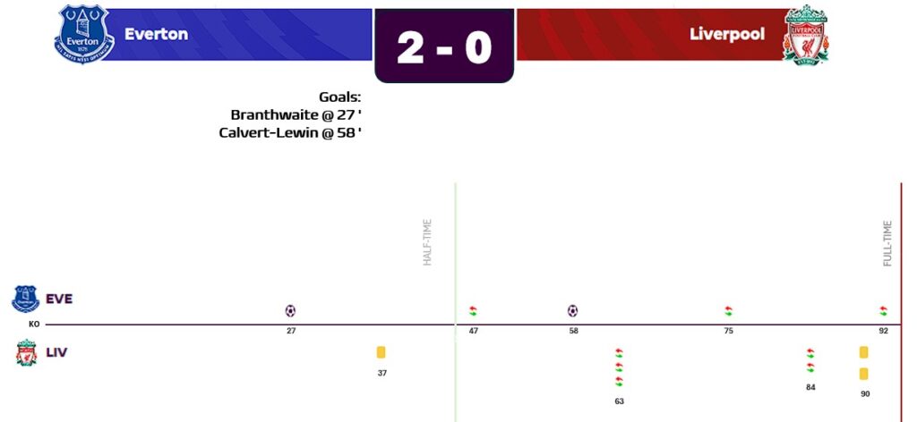
As you can see, it looks pretty darn cool without having to find a designer or an Infographic expert ;)! I must warn you though it takes a lot of work and patience and some planning on data shaping. However, that effort is only needed the very first time, as any other game after this is built, it’ll be just JOY!
You may notice that in my version Liverpool is at the top line and Everton is at the bottom; whereas in the BBC Sports image, Everton is at the top. That’s really easy to change to however you want. This doesn’t bother me at all but to flip it, all we have to do is give Everton a higher unique ID than Liverpool in my data table. This will become clearer in the overview below. So, if you’re interested, I can share with you some of the key techniques I used to make it.
How It Was Built (Overview)
Just by looking at the chart, I know that I need a Swimlane type of chart, but there is no such chart in Excel. So, we’ll have to simulate one and customize an existing type to make it appear so, such that, one team will be above the timeline (x-axis), and another team will be below the timeline. Furthermore, events that relate to one team must appear on its corresponding swimlane. An event such as: Someone from team1 got a yellow card, red card, or someone scored, or the team did n number of substitutions. Not only those events need to appear in the swimlane for that team but at the exact time of occurrences, so the viewer can easily see what happened and when.
To achieve this, I had to create a table with data arranged in the proper way. The first-cut of the table looked like this:
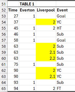
I assigned each team its own unique ID (Everton=1, Liverpool=2). The final chart will show Liverpool at higher swimlane than Everton (think, y-axis); so if you want to show Everton at top instead, you’d assign Everton=2, and Liverpool=2. But we’ll change the order in a minute.
The Time column lists all the times (nth minute) when a relevant event occurred (see above for which events we’re only interested in for our chart). When that event relates to team1, I put a 1 in that row; if that event relates to team2, I’d put the other ID (2) for that row under team2’s column. The Event column then has categorical values so we can clearly distinguish the events. This is critical, as if we don’t, we wouldn’t be able to put different icons for different events! Notice, how we have a different icon for goals events, yellow cards event, substitution events in the chart. We’ll need to relate the numeric values that chart calculations only understand with the category labels later in the construction.
The reason why there are fractions such as 2.1 and 2.2 is because those events occurred simultaneously! And guess what if they’re exactly the same values in my table, they’ll all overlap each other and it would not be possible to know if there was one event or multiple. That’s the reason, I offset them by just enough to be visible on chart scale. This is critical.
If we created a scatter plot on this table, we get a skeleton chart like below:
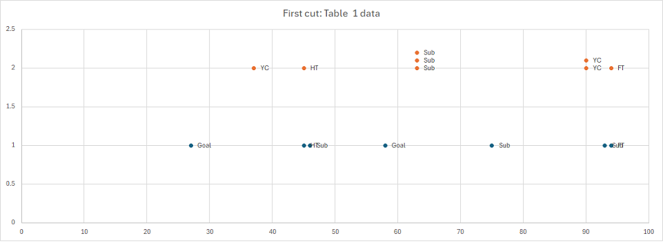
Okay, I’m not nearly close to being done but I’ve solved the biggest problem, which is to shape the data in a way that can be a foundation for further tweaking. Yes, at this point, it looks ugly and maybe frustrating but we are on the right track!
Let’s look some of the remaining things I need to address.
The half-time and full-time markers need to be on the chart AND they need to be vertically going across both teams because those events occurred to both teams at the same time. To achieve that, I had to add 2 more columns to my table (say, HT, and FT) and again, mark them at 45′ (that’s was the halftime) and at 94′ (because the game had 90 minutes + 4 extra minutes as enforced by the referee). As these events occurred for both teams simultaneously, I need to add a row for each team for each time row…so, two 45 values in Time row and for that row under HT column I’ll enter 1 (team1 ID in this case Everton), and on the 2nd row instance for 45, under HT column again, I’ll need to enter 2 (team2 ID in this case Liverpool). Same idea goes for FT at row for Time value 94. Then I added HT as a new series to the scatter plot (it’s Series X-values will be the same Time column values). And again I added FT as another new series. As a bonus (this wasn’t really necessary, but makes it even more versatile and time-saving design), I added another column called Scorer where as Goal event occurred (e.g. at Time 27, row 53 in the above table), I would enter the name of the scorer. With this information, we are actually done shaping the data!
But there’s a lot more customization to be done to get the chart ready. Without making it TL;DR, let me just point out some key items.
- We need to add error bars to HT and FT data values, and adjust their percentages so they cross vertically correctly up to the right height of the chart.
- We need customize the datapoints (which appear as dots by default) for unique events (goal, yellow card, sub, etc.) to unique markers and set each one to appropriate icon or image.
- We need to remove the default data labels, legends.
- Need to remove the grids, y-axis, etc. to clean up the chart more.
- We need to customize where y-axis and x-axis intersect so the x-axis is not sitting there at the very bottom of the chart (so that we can put team1 logo, and events under the x-axis timeline bar).
- Add a textbox that has an underlying formula to bring in and concatenate the string for showing goals and scorers, and the time of scoring.
- Add a Smartshape such as a rounded rectangle, also with a formula, that brings in the final score from the table and another calculate cell (hint: count the goal events for each team), and place it (customize it for size, bgcolor, font color) in-between the team banners at the top of the chart…this will be our “title”. Tip: Be sure to adjust its z-order or it’ll be hidden behind other objects or the chart itself.
- Adjust the x-axis major and minor units to make it more readable.
- After everything looked reasonably well, I decided to tighten up the spacing a little more such that there’s less negative space (whitespace) between the team’s event icons and timeline (x-axis) by reducing the difference between the team1 and team2 ID values. I started out a 1 and 2 respectively. However, to make them tighter, I had to resort to decimal parts as well, that way the difference between them was not a whole 1.0 but a fraction of that, thereby bringing the y-axis values closer to each other, and hence reducing the white spacing between them.
- I also want Everton series to be above the X-axis and Liverpool’s series below.
- Finally, tweak sizes, colors, alignments, groupings, z-order, removing all X-axis time markers except the events markers, etc. to make it more polished.
I tweaked encoding of the Everton and Liverpool such that Everton is above X-axis, and also reduced the difference between the team’s IDs to reduce some vertical whitespace in the chart making it tighter. At that point, the table looks like this:
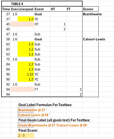
You’ll notice that the scorer’s names, and times, and final score are also coming from the table and cells with formulas below the table. These values get placed onto the chart’s main banner or title bar and the score and scorer boxes.
To put the exact time of the event under each event marker, I add Data labels for each but the values come from specified cells (not default) and they are from the Time column. To do so, while a series of markers are selected, from right-pane of Label options, Unselect Y-values and select [x] Values from cells, and choose all values from Time column in TABLE 4 (no header). Repeat for the markers of 2nd series, selecting the same Time column values and place labels Below.
This will create multiple labels for marker 63 as there are 3 subs (same with 84, and 90)…so select the first two dupe markers for the time, one at a time, and hit Delete key to remove each, and keep just the very last one. Repeat for the markers of 2nd series, selecting the same Time column values and place labels Below. Then make the remaining markers at time events, Bold to make them stand out.
Finally, I want to hide the X-axis labels but I don’t want to remove the axis completely since I need the horizontal line. To do that, just select the X-axis and change its font to color to same as chart background (white). To further adjust the X-axis horizontal line color and thickness, select the X-axis and on right-pane choose Fill & Line tab and adjust them there as desired.
There are other minute details for each of the tasks mentioned above but as Excel is very rich in interface and it has many ways to accomplish a task, you’ll have to learn and pick what works best for you. Creating this from scratch may not be easy the first time, but once you have built it and understand the concept of organizing data across various events and teams, it becomes highly scalable and enjoyable for future charting endeavors.
I hope you’ve found this post interesting. Happy charting!
BONUS: The following is also completely done in Excel, but not using any chart element, rather data sets, unicode, and some layout configurations. This is based on actual game events between ROMANIA and NETHERLANDS that place on July 2, 2024 @ Munich, Germany in the Euro 2024 knockout stage.


Related Blogs: