Is it possible to use Excel for romantic or sentimental purposes? Absolutely! While Excel is commonly associated with routine tasks in accounting, finance, and data analysis, its capabilities extend far beyond these uses. In this post, I will showcase another unusual application of Excel that taps into its potential for more heartfelt endeavors.
I experimented with various methods to create heart-shaped charts in Excel and achieved several successful variations. The most effective formula I found is showcased here for crafting a heart-shaped chart. While I didn’t invent the mathematics behind it, I did discover how to apply it effectively using Excel.
Here is my final output chart:

The beautiful thing about it is that the name, the occasion text are all customizable for any occasion. The chart is all based on a data-range, and the cell references. You can even add more chart elements into it for unlimited customization.
I can print it out as cards. But here’s the cool part, without having to change anything about the chart configuration, if I wanted to change the occasion to another, I’d just enter the new occasion text in a cell. If I wanted to address it to my mom on a different occasion, no problem! Just change the text in a cell for the recipient, and the occasion. This chart is infinitely scalable.
How It’s Done (Overview)
The chart is, believe it or not, a simple XY scatter plot. They key is to first get the data source shaped correctly. So, to get it right, first we have to keep two things in mind: parametric equations to create the shape and chart the data in a polar coordinate system.
To create the dataset, we only need values from 0 to 2π. You can go shorter or longer…try different ways. Once we have that, we can calculate the x variable for a Scatter plot using the formula 16sin(t)^3x=16sin(t)3 and then I added the y variable which has the formula: 13cos(t) – 5cos(2t) – 2cos(3t) – cos(4t)y=13cos(t)−5cos(2t)−2cos(3t)−cos(4t)
That’s all it takes to know. After that, we just need to decide on how many rows of t variable we want. As I stated, 0 to 2π is more than enough and t values are in the formula above that determine x, y row by row.
Next, we add text for recipient, and occasion strings in their respective cells. We can use those cells’ values in Textbox or Smartshape controls on the chart by using formula.
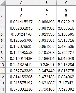
The table should look like this:
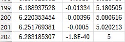
and it should continue for about 200 rows to make a smooth curve. The last few rows should look like this:
At this point, if we charted just the x,y on a scatter plot, we get something like this:
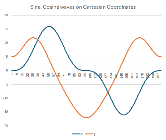
Which shows the relationship between dependent and independent variables and is completely expected. It’s interesting (and foundational) to understand how x and y values are dancing around themselves.
It’s important to note that this is on Cartesian coordinates. What we need to create the heart shape needs to be on polar coordinates. So, that chart now would look like this:
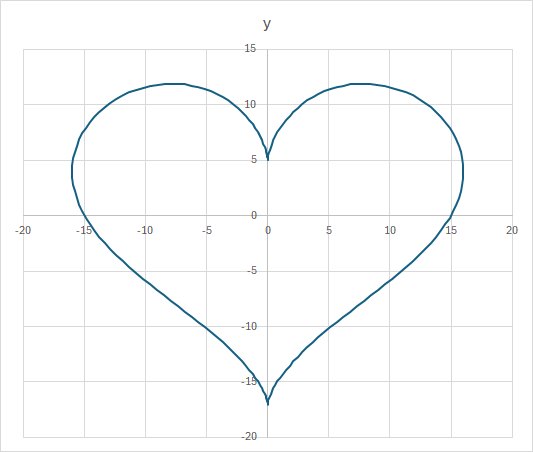
Not bad at all! But not romantic at all, either!! So, we need to tweak it a bit to make it more palatable.
First, remove the grids (both x, y). Then the title. Then each datapoint will need to have gradient fill colors (I just chose deep red to hot pink with 4 stops).
Next, do the same for the chart background. I also tweaked the transparency of the background at each stop of the gradient.
Then we need to add some text for the occasion/message, and recipient text. For those we can insert a new textbox control (or reuse chart title element for one of them). Either way, the elements should refer to their respective cells so all we need to customize it is by changing the occasion and recipient cells’ values.
Then position the textbox elements in their desired places and format the font, size, colors, etc. Once you’re satisfied with the positions, select all elements and custom controls on the chart and select them and the main chart (ctrl-left-click on each), then Group them via Format menu. This way, the whole construct with move together.
That’s all there’s to it! To show you scalable this design is (Excel workbook, with no VBA), here’s my thank-you chart created in 2 seconds from the same workbook without changing anything other than the text in the 2 referenced cells in the chart. You can select whatever message and recipient text, the font, the color schemes, and even add/remove more elements into the chart…the customization on this is beautifully limitless!

Related blogs:
A Christmas Tree in Excel (Happy Holidays!) – Musings (flyingsalmon.net)
Search Results for “soccer” – Musings (flyingsalmon.net)
Creating Beautiful Violin Plots – Musings (flyingsalmon.net)
▛Interested in creating programmable, cool electronic gadgets? Give my newest book on Arduino a try: Hello Arduino!
▟