Every now and then I see some simple quizzes pop-up on Facebook such as: “Name a state without letter A in it.” The letter can be another, they just switch it around from time to time. This particular post is inspired by such posts. Sure we can go through all the states in our heads […]
Tag: analytics
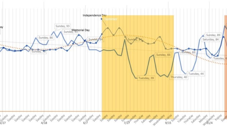
Understanding Trends: Real-world example
Trend analysis is a pivotal part of business analytics, project planning, marketing, and virtually all aspects of strategic planning and understanding of patterns/behavior. In this post, I present a straight-forward but very practical use of some analytics and walk you through: 1) Data collection 2) Data cleanup and shaping 3) Creating trends and understanding the […]
Carbon footprint estimation made easy
Indeed, “Climate change” has been the hot topic for the last couple of weeks. It even surpassed the hubbub around the pandemic the world is experiencing for the past 2 years and counting! Thanks to COP26…the gathering of the “relevant” world leaders to discuss top, pressing issues of the world, the list of which contains […]
Ig Nobel Prize Winners: 2021
The winners of the 2021 Ig Nobel Prize are announced today. One of them caught my attention, which happens to be in the Economics category by Pavlo Blavatskyy for for discovering that the obesity of a country’s politicians may be a good indicator of that country’s corruption. Very interesting indeed and although it made me […]
Raw Data to Machine Learning to Decision-Tree: Excel
Machine Learning in Excel? Isn’t ML the new thing, new algorithm that’s only done in the Cloud using R and Python? Nope! We’ve been doing in Excel for many years!! It’s only recently getting a lot of attention with Cloud and large datasets and made much, much simpler to use for today’s Data Scientists— but […]
Did your promotion work?
In an earlier blog How Well Are Your Incentives Working? I shared methods on how to calculate the various chances of success based on some campaign data (e.g. new sign-ups for membership) from various trials using Binomial distribution. In this post, I show how to determine if events occurred due to random chance or affected […]
Waffle Charts (3 methods + bonus)
Certainly! Here’s a revised version of your paragraph: Waffle charts might be familiar to you. These charts are characterized by small squares within a grid, providing a straightforward representation of ratios. This concept is akin to that of pie charts, area charts, or treemaps—the choice ultimately hinges on the target audience and personal taste. Waffle […]
Counting words/elements correctly in Excel
In some of my previous posts, you’ve already seen my Python examples on how to count words accurately in a document or in blocks of text (search for: Wordcloud). It’s also possible to count the words in Excel, but we have some gotchas there to be aware of. In this blog, I demonstrate some of […]
Putting together our Presidents (Infographic in Excel)
In several of my earlier blogs, I demonstrated working with raw data from multiple sources to generate visual and statistical analysis. You can find them in the following posts: Let’s Play With All The Presidents (Excel)-Part1 Let’s Play With All The Presidents (Excel)-Part2 Getting To Know Our Presidents In this blog, I share the combined […]
When you’re going “blank”! (Excel, Python)
You have data (of course, you do) and you have data that have something missing (of course, you do). The question is multi-fold around that…do we ignore the data, do we remove them from your analysis, or do we interpolate to fill in the missing data? And if so, what type of interpolation is best? […]