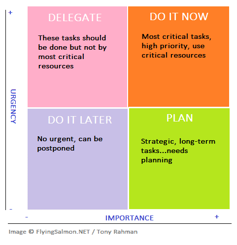
Former US President Eisenhower is known to have said: “What is important is seldom urgent and what is urgent is seldom important.” This is reflected in a popular quadrant design, often referred to as “The Eisenhower Matrix”, used to effectively prioritize tasks according to their urgency and importance.
This can be expressed in a quadrant matrix (image) into 4 quads: DO IT NOW, PLAN, DO IT LATER, DELEGATE (counter-clockwise; DO IT NOW being in the top-right segment).
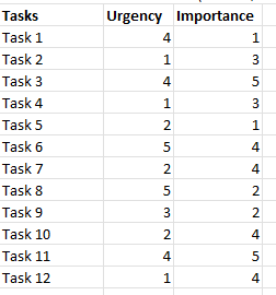
Suppose we have the following tasks and we’ve assigned some urgency and importance values to each as follows:
We’ll put Importance in X axis and Urgency on Y-axis. We find the coordinates of line going left-to-right along the vertical middle. And coordinates of a vertical line top-down along the horizontal middle of chart.
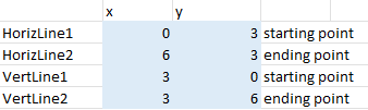
The above points are for the lines separating the matrix sections (1 line going from top to down in the x-middle of chart, another line going left-right across the y-middle).
NOTE: I added -1 for Min values and +1 for Max values to add a little room…adjust this according to data values.
Based on the above data, we can now create a quadrant in Excel just like below:
Steps & Explanation:
There are many steps involved here so carefully tracking each step and understand why we’re doing something is important to create the accurate chart. Experiment with different looks and different scales.
First, Insert a Scatter chart based on the Urgency, Importance values. This will insert points for both Importance and Urgency…we don’t want that, so after chart is placed, right-click and Change Chart type to the next choice with only 1 set of data points (e.g. Importance). This will generate a chart as follows:
// image picture5
Change the title, and axis bounds for min/max for X and Y axis if needed. Click on the gridlines for x, y inside the chart, and delete them one by one. It should look like this now:
// image picture6
Next, we’ll add points for the cross-hair lines for the grid separators.
Right-click on plot, Select Data: Add (add a series) and in its X values, select the values down the x column for HorizLine1 and HorizLine2 (3.g. 0,7)
And in X values field, select the values down the y column for HorizLine1 and HorizLine2 (e.g. 3,3)
OK. Next, we need to connect these 2 points with a line.
Click on one of the data points on this series just added, both points will be highlighted, then right-click Format Data Series->In right pane, Fill & Line: Line->Solid line. (Change the width to your liking while at it).
Next to remove the datapoints for the grid line…finally, click on Marker tab there-> Marker Options: None.
Repeat these steps for the vertical grid line as above by adding a new series again, and set its X coords for VertLine1 and VertLine2 (e.g. 3,3), and for Y values, choose y column values for VertLine1 and VertLine2 (e.g. 0, 7).
Next, we need to adjust the min/max of x and y axis on chart by clicking each and formatting their bound values in format pane. NOTE: I used round() to find the middle points for x,y of the gridlines based on data.
Add data Labels: Click on a data point, right-click Data Labels…this will by default add the values from Y axis, but we want the Task names instead. To change, it click on a label with value (NOT the data point dot!) and it’ll enable Label Options in Format pane. There, choose [x] Value From Cells and choose the Tasks names range (without header) column, and Uncheck Y Value.
Also, increase the font and font size of the data labels as needed.
Let’s put some final touches to it. Color code and label the quadrants. To do this, Insert->WordArt (Text group). After inserting, change the font size/face from Home menu. To change its color, select it, then Shape Format menu: Text Fill (from WordArt Styles group). To use a background color for text, Shape Format menu: Shape Fill (from Shape Styles group).
Finally, remove the X, Y axis labels.
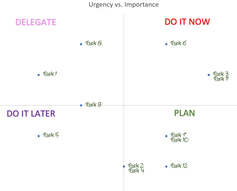
Once again, the final chart is below. You can continue to customize the look from this point onward to your liking.
▛Interested in creating programmable, cool electronic gadgets? Give my newest book on Arduino a try: Hello Arduino!
▟