What do butterflies and tornadoes have in common? 🙂
Butterfly charts aka Tornado charts are a special type of Bar chart where the data categories are listed vertically instead of the usual horizontal layout. It’s suitable for comparing different variables between two groups (e.g. male/female, apartment/house, car/boat, etc. etc.) and what variables you measure is up to you which governs the appropriate dataset.
In this post, I’ll demonstrate creating different styles of Butterfly charts in Excel and in PowerBI independently, touch on the differences, and their pros and cons. Along the way, I’ll talk about extracting key metrics of the dataset and using a histogram to aid the visual for the stats.
The Data
I’ll demonstrate the concepts using two different types of dataset. Let’s start with a simple one. Here we have two groups (or teams if you like) who have active players in the following sports. The data shows how many players from each group are active in a particular sport.
First dataset
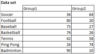
There’s no repetition of the sport. All the numbers are already tallied up. This is an ideal dataset to create charts right away. We can create a butterfly chart even actual using any real Chart elements as shown below:
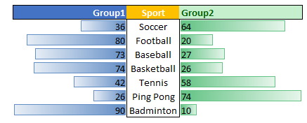
This is done in-line, inside the cells using conditional formatting for each group’s data (Data bars). And then using Manage Rules->Edit Rule, I set the bar direction Right to Left for one group, and opposite for the other group. Rest of it are cosmetic, such as removing gridlines, formatting and aligning the Sport category labels.
This was painless, quick and effective. But next, I’ll add more challenge by a little more cluttered dataset and create more complex, interactive charts. Let’s continue…
The next dataset
You have the following information on players signed up for various sports in a club. The data is scattered and is in no particular order. The sport names repeat, and the data is not organized by Sex or Age either. They just appear in a worksheet as members came in and signed up. The note-taker only entered if the person was a male or female, his/her age, and the sport to sign up for throughout the open membership period. 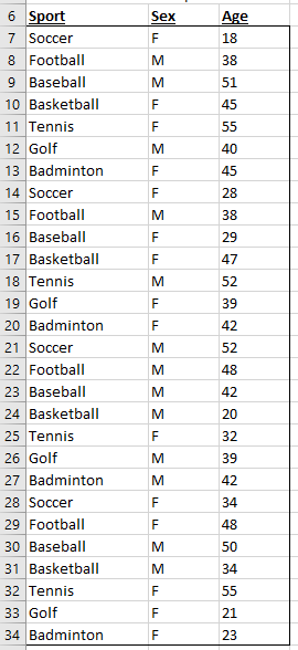
Objective
My objective is to understand the distribution of members by gender, age groups, and sports. This is instrumental in providing the best offerings to the members, investments, resource planning, scheduling, etc. with a clearer understanding of the customers.
Before we get into the fancy visuals, let’s start with some key metrics:
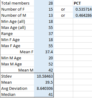
Now we can tell what’s average ages of female, male members are, and overall average age across genders. We can also tell 54% of our customers are female, and the spread of ages across genders, and much more. These are obtained by basic statistical functions in Excel but the key here is that the data is NOT sorted or grouped with repeating rows (albeit unique records), so I have to first extract the age data for, say, only females, and then apply MIN(), MAX(), etc. To get the mean male age for example, my formula is:
|
1 |
AVERAGE(FILTER($C$7:$C$34,$B$7:$B$34="M")) |
[where C contains Age, B contains M or F to denote male/female]
With a histogram chart, we can neatly bucketize the ages in dataset into 4 buckets so we can quickly home in into any specific bucket for specifics. Since we already have the age column C, we use that as the Series values. This is what it looks like:
 We clearly see that most of our members are within 30 and 54 years of age.
Next, let’s ease into creating a butterfly chart in Excel….
Since there’s no built-in Excel butterfly chart (at this time) we have to create one ourselves but using 2 different charts…each is a clustered bar chart. Their source data is coming from 2 different pivot tables as below, one for female ages, another for male’s:
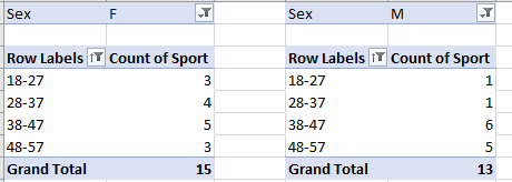
These, independent of the histogram chart, are also grouped into buckets of ages starting with 18 and incrementing by 10. The specifics of the grouping depend on the dataset. In this case, it makes perfect sense to do this way.
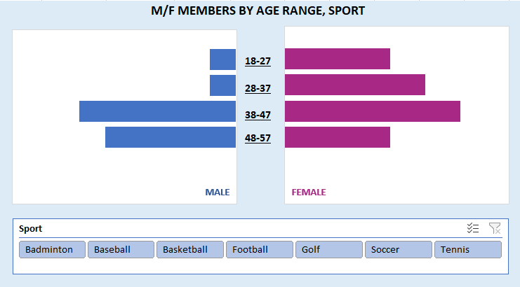
After some manual alignment and sizing of the charts for readability, I added the center labels for the same groups as they appear in the pivot tables. Finally, I inserted a slicer for Sport field. Then connected the slicer to both male and female pivot tables…so that both charts are updated when the slicer changes. At this point, we have the final butterfly chart in Excel:
To see how it works with user-interaction, see the clip below:
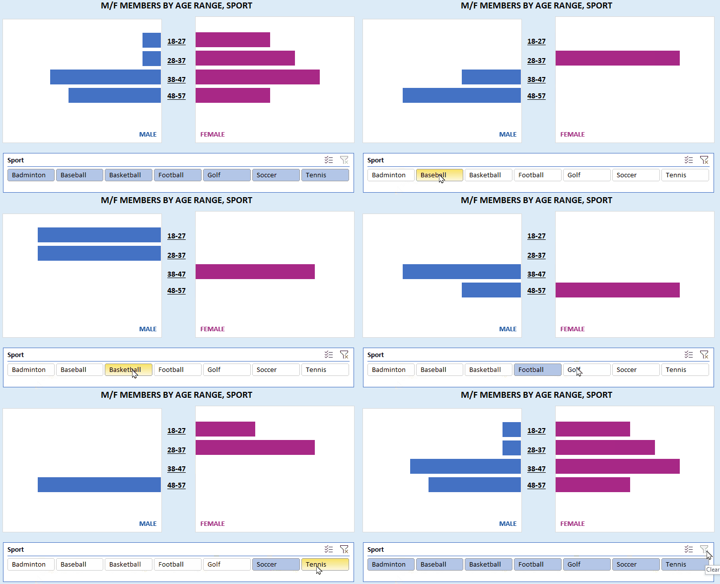
As you can see, it’s really easy to see all-up Sports memberships or just any particular one using slicers and its filter.
Enter PowerBI
There’s a custom chart control called Tornado chart in PowerBI as an add-on. Import Tornado chart into the report from PowerBI gallery or Microsoft AppSource. Then import the same dataset as above into PBI. Transform it as necessary (e.g. headers, extra cols, rows, etc.) depending on your layout of the table/range.
Once the chart control is placed on canvas: to see a Tornado chart of Age distribution in Sports by gender, we set Values field to Average of Age, Legends=Sex, Group=Sport. And the following chart is created:
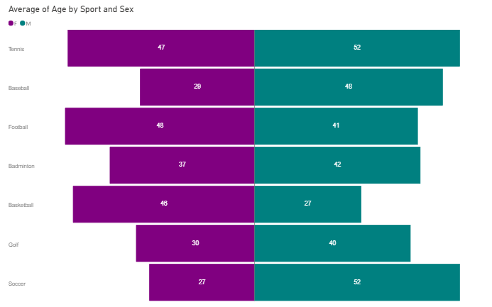
To see a Tornado chart of gender distribution in Sports, we set Values field to Count of Sex, Legends=Sex, Group=Sport. And it’ll look like this: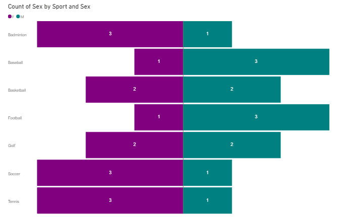
Main difference is you won’t have the option in this version at least for group labels to be in the middle of age values, however, it’s actually much easier to create than in Excel albeit less customization ability. Also, instead of providing interactivity by slicers (in Excel), it provides interactivity by clicking on a bar (select a particular measure) and by hovering mouse (hovering over any bar will show details in a tooltip).

Now you have seen how to extract and arrange appropriate values from a dataset of different original shapes, create butterfly/tornado charts in both Excel (2 different ways) and PowerBI.
Related Blogs:
This post is not meant to be a formal tutorial, instead it is to offer key concepts, and approaches to problem-solving. Basic->Intermediate technical/coding knowledge is assumed.
If you like more info or source file to learn/use, or need more basic assistance, you may contact me at tanman1129 at hotmail dot com. To support this voluntary effort, you can donate via Paypal from the button in my Home page, or become a Patron via my Patreon site. A supporter/patron gets direct answers on any of my blogs including code/data/source files whenever possible. At the very least, it’ll encourage me to share more posts/tips/knowledge in the future.