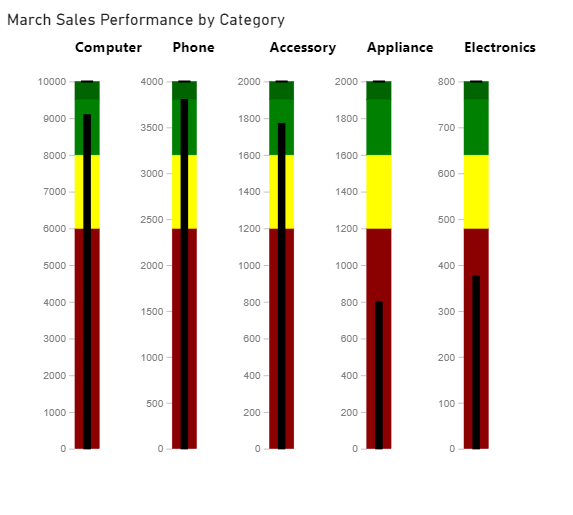
Scenario
We have transactional data for 3 months. We want to compare any month’s sales performance with our goals by category of products sold.
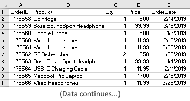
The following information is available in one dataset: OrderID, Product, qty, price, date of order as they occurred. As we see below, they’re not tallied or grouped or sorted in any way.
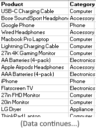
And to map products to categories, we have another table with fields: Product, Category
Objective
We want to compare monthly total sales per category, and apply some qualititative metrics across categories month by month to see the overall picture. This will help us see the performance of each category month over month.
Steps
First we want to extract monthly data from transactions dataset so that we have a shape that’s conducive to the pivot tables and charts we need.
We need: Category, sales per category for each month (and their totals). So we can create a data table such as below:
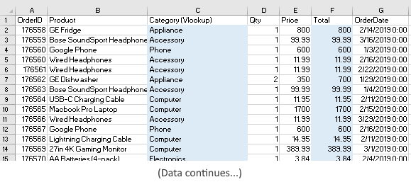
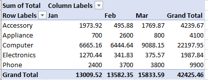
Now using lookup function, we’ve filled in the Category column. Also, with simple arithmetic, we have calculated a new column Total for each category. We can now create a pivot table to summarize this as follows:
However, before we can apply some qualitative metrics, we need to qualify the qualitative boundaries. e.g. what’s Good, what’s Target, etc. In our case, say, Good can be 60% of Target. Satisfactory = 50% of Target. Excellent can be 90% of Target.
With this information and the pivot table we created above, we have a clean table ready for charting:
The Charts
We could use various chart designs in Excel to get the point across. But here, I wanted to use a gauge-type of chart called Bullet Chart. A Bullet chart is a good replacement or a complement to other types of gauges, and is suitable for tracking goals and performance. It’s possible to create it in Excel with some manual (tedious) work, but PowerBI already provides this type of visualizations. So, I’ll import our data above into PowerBI (desktop or cloud version).
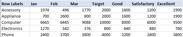
Once imported, we need to import the Bullet Chart from AppSource (it doesn’t yet come automatically out of the box). For comparison, I also imported a Dial Gauge. The dial gauge does not provide the flexibility or efficiency as Bullet chart, but it looks like this based on the data for March.
 Here it’s telling us that for March, the total target (for all products in all categories) sales was $17,860 and actual was $15,834. For a single dimension, it’s helpful but not really helpful to tell which category performed the worst/ok/best! Also, in its configuration, the field settings are awkward and confusing. But again, most importantly a Dial gauge cannot show different categories in a single chart.
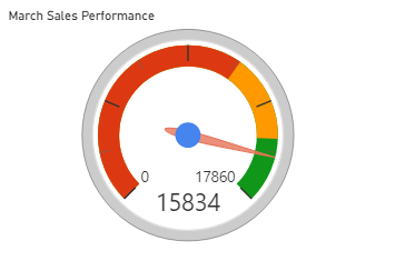
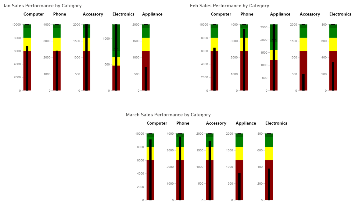
Back to Bullet chart, after setting the fields and values accordingly, we get a beautiful, impactful chart as below (showing for March). Note that I didn’t have to manually compute even the totals because of the way I shaped the data, the chart can easily figure out the sums of all categories per month!
The black thinner line along the middle of the bar of each category is the actual sales totals. The red zone indicates areas where we ideally do not want to be…it’s less than “Good” (or in “Needs Improvement”) well short of target. The green zone is Good range and the slightly darker green zone is the Target or Max if you will in the Excellent range. The yellow zone is the “Okay” or “Satisfactory” range.
It’s clear to see that in March, the Appliance sales at $800 was well below the target $2,000 and hence in the red zone, whereas Phone category is right up in Excellent zone as it’s within 95% of the target of $4,000. It’s really easy on the eye and head to read 🙂
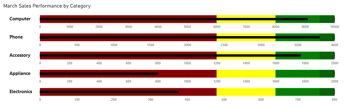
One of the cool features of this chart is also being able to see it vertically, much like a thermometer gauge as shown below:
We can then incorporate data for the rest of the months and compare them side by side, month over month!
Hope you like them.
P.S. Did you notice something different in the 3 charts above other than the differing sales amounts? Yes, each category has its own scale but the images scaled to show small/large data in same size. Anything else??? Yes, the order of categorical data…and now it’s easy to why.
▛ This post is not meant to be a formal tutorial, instead it is to offer key concepts, and approaches to problem-solving. Basic->Intermediate technical/coding knowledge is assumed. If you like more info or source file to learn/use, or need more basic assistance, you may contact me at tanman1129 at hotmail dot com. To support this voluntary effort, you can donate via Paypal from the button in my Home page, or become a Patron via my Patreon site. A supporter/patron gets direct answers on any of my blogs including code/data/source files whenever possible. At the very least, it’ll encourage me to share more posts/tips/knowledge in the future. ▟