In this post, I’ll share tips on how to create a 2D array and map it to a visual grid to depict it using Python. 2D arrays (or 2D lists as they’re called in Python) are fundamental to any programming language and tackling them requires understanding language-specific syntax, however, the core concepts are the same regardless of language…and once understood, implementing and using one is much simpler. Next, we’ll look at how to take this array in memory and depict it in a graphical way. Then we’ll look at some more advanced visualizations from that understanding.
First, the following code will create a small 2D array in Python:
rows, cols = (3, 5) # 3 rows by 5 cols
ra=[]
for i in range(rows):
col = []
for j in range(cols):
col.append(0)
ra.append(col)
print(ra)
out: [[0, 0, 0, 0, 0], [0, 0, 0, 0, 0], [0, 0, 0, 0, 0]]
What we’ve just done is created an empty array object called ra, declared the dimensions (rows, columns) values in different variables, and for each row (as defined by rows value: 3) we keep adding to its 5 columns (one by one) a value of zero. So, we have a 2D array that looks like the above shown in out: in memory. We can also print it like a matrix which may be easier to track rows and colums by:
for row in ra:
print(row)
And the output would be:
[0, 0, 0, 0, 0]
[0, 0, 0, 0, 0]
[0, 0, 0, 0, 0]
Now, let’s put some values in this array at some locations. For example, we’ll execute the following lines of code:
ra[0][0] = 1 # Change item in 1st row, 1st column to 1
ra[1][2] = 1 # Change item in 2nd row, 3rd column to 1
ra[1][3] = 1 # Change item in 2nd row, 4th column to 1
ra[2][1] = 1 # Change item in 3rd row, 2nd column to 1
ra[2][3] = 1 # Change item in 3rd row, 4th column to 1
ra[0][4]=1 # Change item in 1st row, 5th column to 1
ra[1][1]=’X’ # Change item in 2nd row, 2nd column to ‘X’
ra[0][3]=’X’ # Change item in 1st row, 4th column to ‘X’
ra[1][4]=’X’ # Change item in 2nd row, 5th column to ‘X’
ra[2][4]=’X’ # Change item in 3rd row, 5th column to ‘X’
If we print out the array now, the output will be:
[1, 0, 0, ‘X’, 1]
[0, ‘X’, 1, 1, ‘X’]
[0, 1, 0, 1, ‘X’]
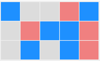
Next, we want to create a graphical representation of this array. Imagine each of these memory locations is a box, so we want to draw a box. Then also consider the values in that memory location, so we need to also be able to show graphically the value or the essence of the value. Let’s say, if the value is 1, we show the box in blue, if it’s zero we show it as gray, and if it’s a ‘X’ the box will be orange.
To do the graphical part, we can use the very common tkinter library. If you haven’t used it before, you can search for ‘tkinter’ on my blog site for some examples from the ground up. Here, I won’t repeat the set up necessary for tkinter but jump right into the actual part where it deals with the 2D array in memory and then drawing graphically.
The idea is to loop through each row in an outer loop, and within it loop through each column of the current row and check the value at the intersection of current row, current column of the 2D array (called ra here) and check against our requirements (value->color of box) as described above. One implementation is below. totalrows is 3, totalcols is 5 in our example. The W, H variables represent the width and height of the desired graphical box (rectangle to be precise) in pixels. I set it to 64 but it’s completely scalable and my code below will work perfectly when the dimensions are different and unequal.

Note how I create a rectangle for each column and check against the 2D array in memory for its corresponding location and then decide how to color the box (fill color in this case). The colors are in hexadecimal values. The other thing to keep in mind is when to finish drawing boxes side by side and when to go to the next row and so on. This is done by tracking the number of boxes (rects variable) within the loop. We also need to ensure the positioning of the drawing of each box so they don’t overlap (otherwise, they’ll appear as a solid rectangle)…this is done by using a variable gap which is set to 2 pixels by me (can be whatever makes sense), similary, we need to keep track of vertical gaps between rows of rectangles. Finally, the ra[i[j] refer to the intersection of row and column, meaning the specific location of memory for the current value of i and j which are being iterated. There are fancier, short-hand way to do this, but I feel the way I did it here is the best way to understand and explain to others.
The output now looks exactly as we planned: (notice how the text output of the 2D array above matches with the intended colors and boxes below)
If you’ve followed the process so far, you’re ready to take it a step farther to see how we can use the same concepts to create visual graphs! Scaling isn’t important (you can tweak that later) but to be able to deal with 2D arrays of different data structures for different purposes is the key. With that, let’s move on to the next example…a more real-world scenario.
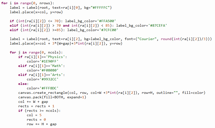
You have the following data of students from a class: their names, subject, and their scores on that subject. The students are: Bob (his math score is 93), Jim (his Arts score is 69), Zoe (her Physics score is 55), Arnold (his Physics score is 80). This information could be presented in a data structure as follows in Python:
ra = [
[‘Bob’,’Math’,’93’],
[‘Jim’,’Arts’,’69’],
[‘Zoe’,’Physics’,’55’],
[‘Arnold’,’Physics’,’80’]
]
Our objective is to show the above information visually, effectively, concisely! Breaking it down further, we decide that each subject will be color-coded as follows: Math: Salmon, Physics: Blue, Arts: Violet.
Then we need to label each of the subject with the corresponding student’s name. Next, we show the relative sizes of scores by drawing rectangles that depend on the score themselves. So, the higher the score, the larger (wider in this example) the rectangle will be. Additionally, the score labels will also have color-coding as follows: if score <=70, orange; if score >70 and <85 light sky blue; and if score >=85 lime green. Finally, to even make the information jump out easily to the viewers, we’ll make the font sizes of the score numbers themselves variable by the score…the lower the score, the smaller the font, the higher the score the bigger the font size.
That sounds like a lot of requirements, indeed! But now that we know how to deal with any 2D array element and loop through rows and columns, we can use tkinter to do the graphical parts and add some math to map the size of fonts and rectangles to the scores. The actual math for mapping will vary depending on the window size of the canvas you created, the desired maximum and minimum font sizes…because they’ll all affect the actual placement of each element on tkinter canvas (i.e. name, score, rectangle coordinates).
My implementation is shown below:
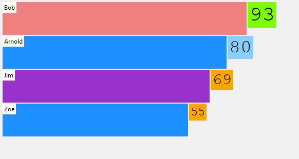
Notice how the score data mentioned above match directly to what’s depicted here and how much more information is conveyed in this single graph.
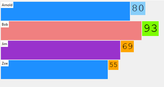
You may notice that the scores are sorted in this graph, although the data in the 2D array isn’t sorted at all. This is done by using sort() function and some lambda magic as follows:
ra.sort(key=lambda x: x[2], reverse=True) # ra is the name of the 2D array for example
Basically, the above will sort the unsorted 2D array in-place (mutates the array in memory) in descending order (reverse=True) and it sorts it on 3rd column of our 2D array, which is the score. All arrays in Python use 0-based index.
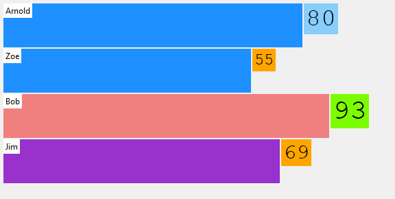
To sort by name, we’d sort it on first column: x[0] and to sort by subject, we can sort it on 2nd column: x[1]…they’re both shown below. To sort in ascending order (A-Z, or low to high), set reverse=False.
My code that generates any of the above is shown below. Just specify the sort order and sort column (as stated above), then sort the array in-place before entering the loops below.
There’s another variation of the graph that I personally created, which I think is much more meaningful that the bar-like graphs above…I call it Folder-Tab graph. Basically, the idea is that the smallest folder (meaning smallest score) will be on front (so it doesn’t block the others behind it) and the folders get larger progressively behind it based on score. The name of the folder will be the student’s name, and the tab will be the score. Color-coded as above (by subject, score) and font-size variation by score.
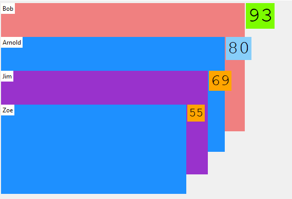
You may wonder: what is two scores are exactly the same for two different students, will the folders be overlapped in Folder-tab graph? The answer is: No. It’ll still be able to show beautifully as shown in output below (where Jim and Zoe both have scores of 55).
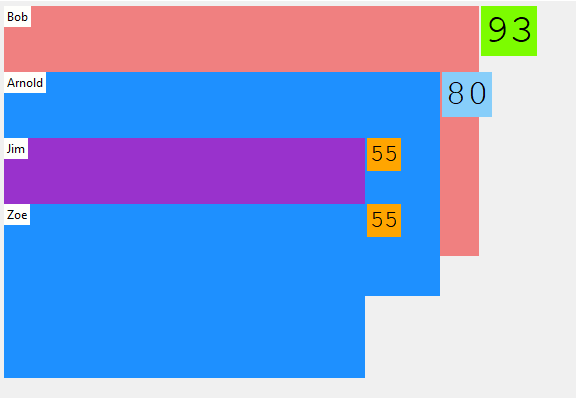
Next, you may wonder: What if Zoe, Jim, and Arnold all scored identicals scores in Physics…wouldn’t the rectangles show up as one large box with 3 tabs? Answer is: Yes in that case, but it doesn’t have to be. You can simply add a border to any rectangle of another color (black, white border for example) to show the perimeters of each! It’s easily done in tkinter by specifying outline attribute, e.g. outline=’#ffffff’ for white outline around each rectangle instead of where I have outline=” in the code above (which in that case means: no outline).
I hope this was interesting and educational. Cheers.
▛Interested in creating programmable, cool electronic gadgets? Give my newest book on Arduino a try: Hello Arduino!
▟