Some time ago I demonstrated how to create Time-lapse animations in Excel in my post here. Part of that procedure utilized a short-lived but cool feature called ‘PowerView’. Unfortunately, as of late 2021, Microsoft has removed support for PowerView in Excel (that made this time-lapse animation possible) and instead is encouraging users to use PowerBI instead. But we can still create those without having to buy additional software — you’ll need Microsoft Office that includes Excel and PowerPoint, and a free trial version of PowerBI.
Below are some examples of time-series data on gun violence in USA that I scraped from GVA (Gun Violence Archive) and CDC official sites with the latest data published as of date. Once the data are cleansed in Excel, I created several static charts first within Excel. After which, I created various animations using two difference methods: with PowerPoint, and secondly with PowerBI.
The PowerPoint animations are simplers to create and also overall limited in its capabilities, whereas PowerBI requires some learning of the tool and some data analysis skills before preparing the data for proper visulations…although the final charts may look the same as in Excel, the steps and terminology are very different from Excel’s. However, because PowerBI has many add-ons to choose from over its built-in visualizations, it’s also more powerful.
Let’s take a look at some of them…
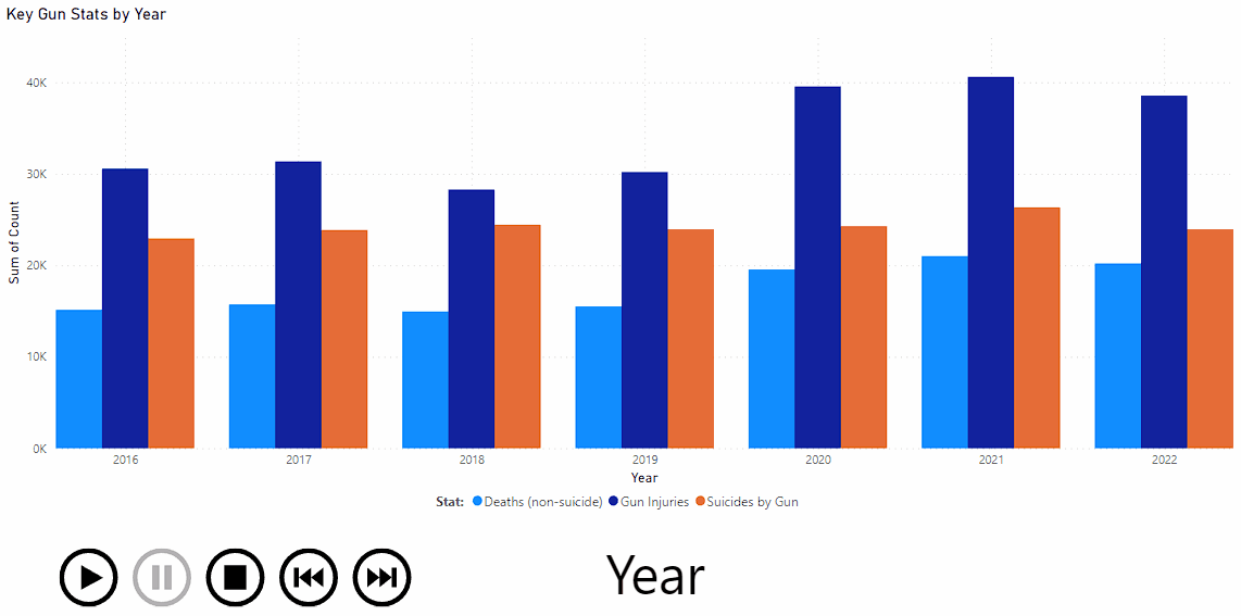
The following utilizes a toolbar for playing the animation like a video clip with ability to move forward/backward pause, etc. Series for each metric is shown per year one by one showing the year at play in big letters.
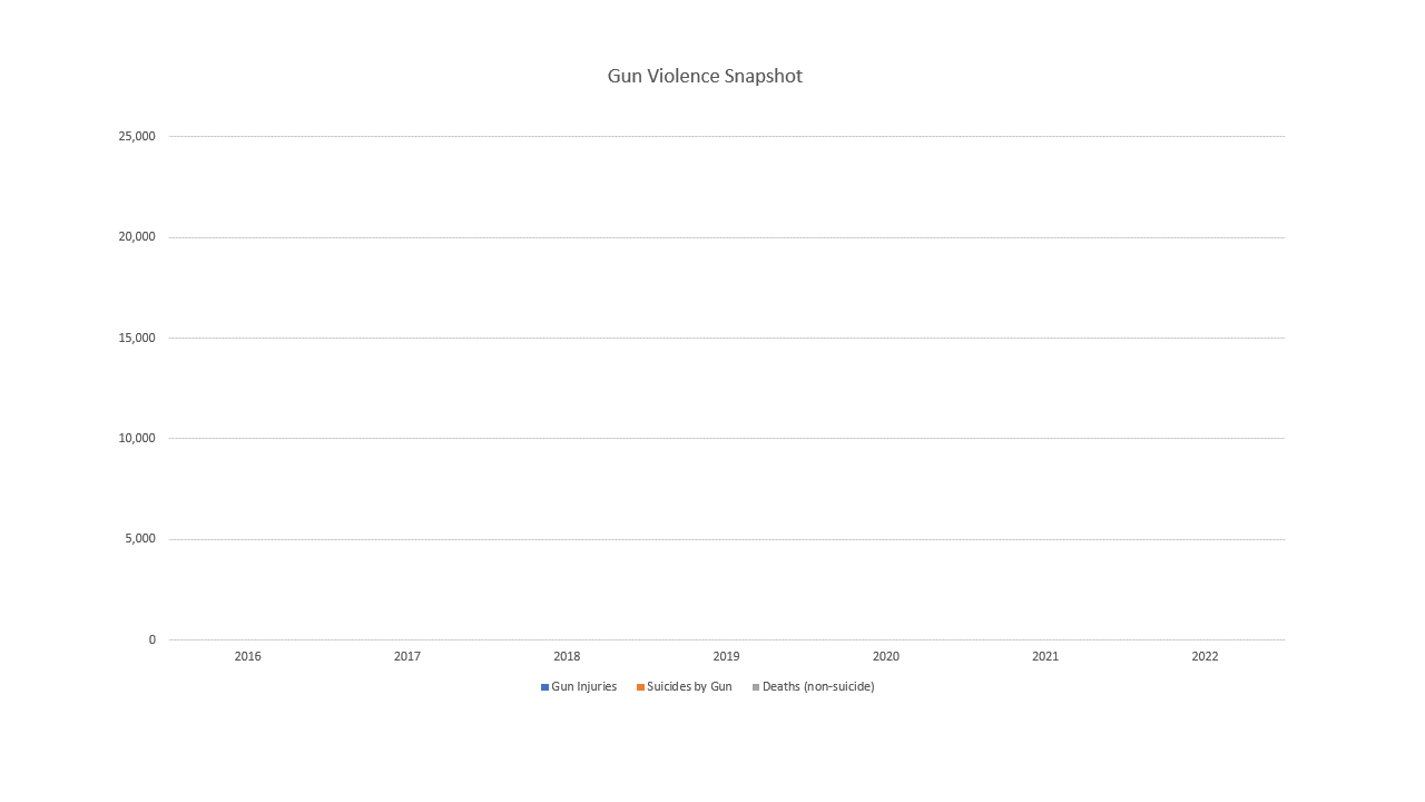
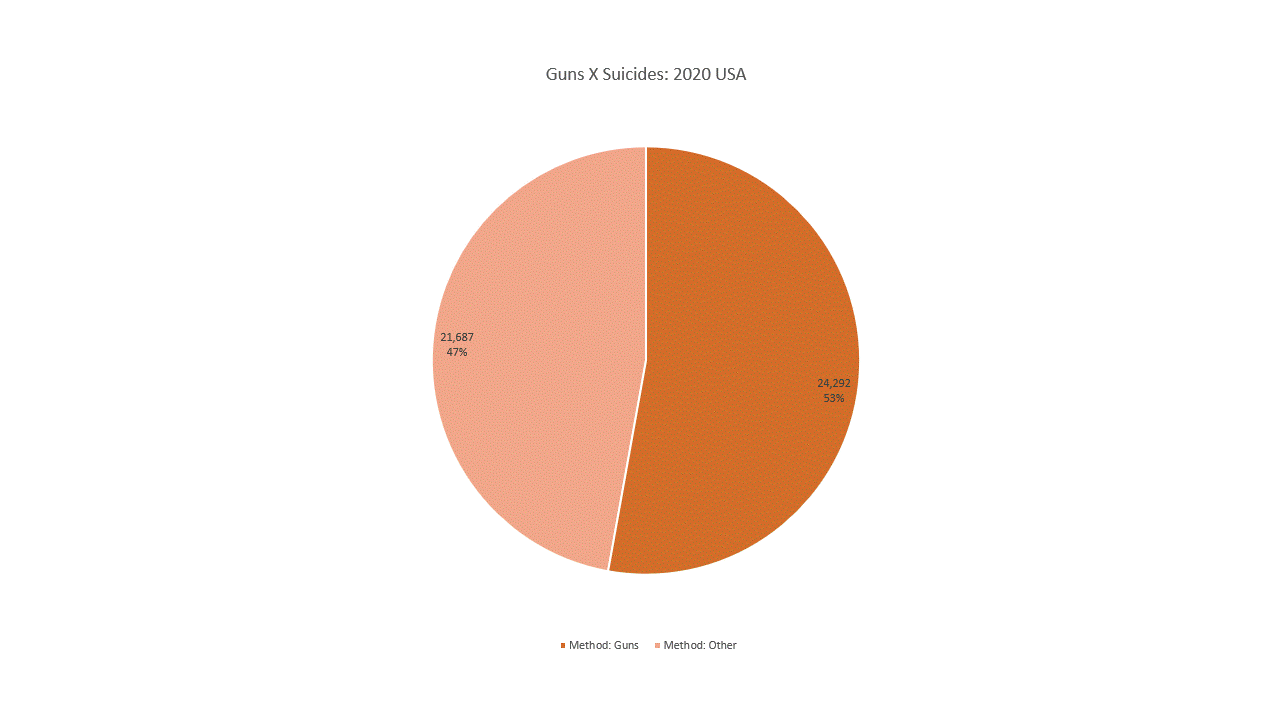
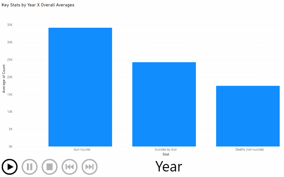
Below is a vertical bar chart that shows several key metrics in their own bars but overlayed over the overall average for each. For example, I’m showing data from 2016 through 2022 for: Gun Injuries, Suicides by Guns, and Deaths (non-suicide) for each corresponding year in that range…behind the scene, I also find the averages for those 3 metrics across the time range and draw a the light blue bar representing that overall average metric. Then each of the actual metric for a particular year is shown overlaid on top of those averages as a darker blue bar. This clearly shows which year, and which metric had higher or lower than average.
The following chart demonstrates usage of time-slice control tying into the underlying dataset. User can easily see all the data or any portion of data on demand.
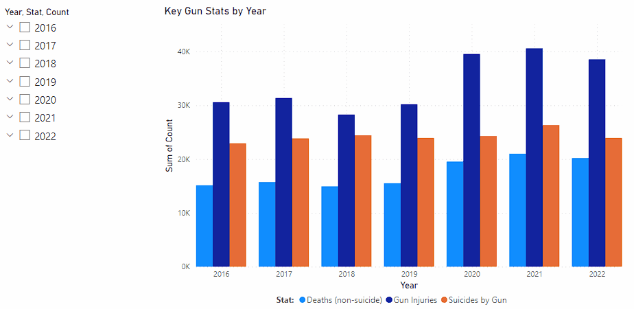
B1, B2, B3 charts were done in PowerBI; after the report with charts is published, users can interact with the toolbar in real-time making it even more useful.
Once these charts are generated, we can export them as animated GIFs, Videos, PDF and other formats that can be directly embedded into a web page.
Hope you found this useful. Be sure to check out my many other related posts by word search or tag search on this blog site.
If you’re interested in more stats on gun violence, specifically on mass murders in the USA, here is a very good BBC article on that with various charts.