In my previous blog on Sigmoid function, I touched on its usefulness and how it’s used to solve Logistic Regression problems either in binary or multiclass classification scenarios. Be sure to check that out https://flyingsalmon.net/?p=3879 first! In this blog, we’ll be using a dataset containing people’s ages and whether or not they bought life insurance in an Excel sheet. Then we’ll built a Machine Learning model where the machine can predict whether a person will buy life insurance…in both Excel and Python.
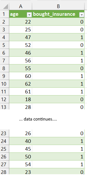
The dataset we have is below (which is a local file: insurance_data.xlsx). We could use a URL, or a CSV file instead and the methods will work just by changing the file name path with pandas.read_csv (for CSV file) etc.
OBJECTIVE: Predict if a person would buy life insurance based on their age using logistic regression.
Excel does not have built-in, out of the box solution on logistic regression of this nature (at least at the time of writing), but we can still leverage it for Machine Learning and take a little bit more steps to get our answer. In Python however, it’ll require less steps. Keep in mind though: the concept here is the key…not the syntax and number of steps!
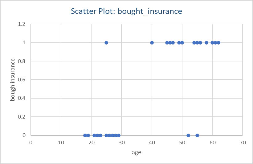
We should first plot the data we have and see if this is a logistic regression problem or linear.
You can also import the dataset from the url below and import it directly into Excel: https://raw.githubusercontent.com/codebasics/py/master/ML/7_logistic_reg/insurance_data.csv
Attribution: This post was inspsired by https://www.youtube.com/c/codebasics where there are some great series.
Excel does not have built-in, out of the box solution on logistic regression of this nature (at least at the time of writing), but we can still leverage it for Machine Learning and take a little bit more steps to get our answer. In Python however, it’ll require less steps. Keep in mind though: the concept here is the key…not the syntax and number of steps!
We can clearly see a straight line will not give us accurate prediction as the datapoints are really at 0 and 1 y-axis and nothing in-between. This calls for a Logistic regression approach.
First, I’ll find the correlation between age and from the dataset in Figure 1 using Excel’s CORREL() function by inserting parameters as: age, bought_insurance values arrays. I get 73% correlation…so definitely there’s strong correlation between age and having life insurance!
Next, I will use FORECAST.LINEAR() function passing known_Ys (bought insurance: 0/1), and known_xs (age). Where x is what we are predicting for (e.g. a specific age). The output I get for a set of input ages are shown below:
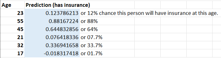
We can clearly see that Excel predicts high likelihood of a person buying or having insurance at age 55, than someone at 32.
Now Excel has learned and predicted the outcomes and I can enter any new value in Age column, and the results (prediction in likelhood) will be computed by the machine. This is really helpful! If I wanted to convert the prediction to just 0 (will not buy insurance) and 1 (will buy insurnace) instead of a percentage, I can simply add a new column with if-else function: e.g. =IF(Bn>0.5, 1,0) — meaning if likelihood is >50%, make it1, otherwise make the output value 0; where n is the row number where a age value resides. The output with 0 and 1s is shown below:
Now that we have solved it in Excel, let’s see how it works in Python too! We can use Python’s scikit (sklearn) library’s Logistic Regression much like we did Linear Regression with that library in my other blogs. It also returns 1 (has insurance) or 0 (does not have insurance) for an input age.
We need the following libraries:
import pandas as pd
from matplotlib import pyplot as plt
and we’ll read in the dataset (which in my case, I have downloaded locally as insurance_data.xlsx in current directory.
df = pd.read_excel('insurance_data.xlsx')To create a scatterplot in Python, we can do this:
plt.scatter(df['age'],df['bought_insurance'],marker='+',color='red')
plt.show() # show the graph (not needed in Jupyter but needed in other IDEs)
See Figure 1 and match the column names accordingly when calling pyplot.scatter() function.
Next, we need to import train_test_split module to do the splitting for us. That is, some percentage of dataset will be used for training, and the rest for testing.
from sklearn.model_selection import train_test_split
x_train, x_test, y_train, y_test = train_test_split(df[['age']],df.bought_insurance,train_size=0.8)
print(x_test) # this will output the ages picked for test dataset (20% of full data)
The output of x_test may look like this (Note that the computer is picking new sets of rows while keeping at 20-80% split as we specified above for testing and training respectively.
     age
7    60
21   26
15   55
20   21
16   25
4    46
Above, we are using 80% of dataset for training. Ignore the first column which is Python showing its index (row#, 0-based)…we’re only interested in the age column output at this time.
Next we need create a logistic regression object and then fit the data (e.g. training the machine). The statements look like this:
from sklearn.linear_model import LogisticRegression
model = LogisticRegression() # create a regression object (a model)

# train the model...
model.fit(x_train, y_train)
We are now ready to do prediction by the machine! So, we’ll pass the dataset from test portion (20% of data becuase we used 80% for training) and see what we get with the following lines:
model.predict(x_test) # predict with test data x_test (for given ages)
#To see the output:
print(model.predict(x_test)) # out: [1 0 1 0 0 1]
So we get output as a list of zeros and 1s. What this means that the first age category from x_test gets 1 meaning that person bought or will buy insurance, the next one is 0 meaning that person does not have or will not buy insurance, and so on! This can tell a company where they should spend advertising $$$.
Note that we got yes/no (1/0) values right away in the ouput! We can also get the probability as we did with Excel instead:
print(model.predict_proba(x_test))
The output looks like this:
[[0.05835099 0.94164901]
[0.92804033 0.07195967]
[0.11960902 0.88039098]
[0.96584149 0.03415851]
[0.93784615 0.06215385]
[0.35821854 0.64178146]]
How do you read this output? Here’s the explanation…
The first item in each array is: Probability of one class vs other class. e.g. person NOT having insurance (e.g. 5+%) vs person having insurance. The first item is probability for 0 values, and second item is for 1 values. NOTE: The first and second values in each array item add up to 100%.
So if the first array is for age 60 (output of x_test), it says probability of him NOT having insurance is: ~5%
and prob. of him having insurance is ~95%
If the next array items is for 26, it says probability of him NOT having insurance is: 92.8%
and prob. of him having insurance is 7.2%
The last item at age class 46, is ~64% likely to have insurance and ~36% to NOT have insurance as shown in output: [0.35821854 0.64178146]]
These probabilities match up perfectly with the output of model.predict(x_test)) which is: [1 0 1 0 0 1]…meaning 1st age class has insurance, next class does NOT, next has insurance, and so on. To see which ages these 0 or 1 is associated with, refer to the output of x_test above (age column: 60, 26 … 46).
And even predict for a specific age that’s not in the dataset as below:
answer=model.predict([[25]]) # out: 0
answer=model.predict([[45]]) # out: 1
In the above 2 lines, I passed age 25 and 45 respectively and got 0 and 1…meaning, the 25-year old will not have or buy life-insurance, and the 45-year old is likely to have or buy it.
But confident is the machine with these predictions? There’s nifty way to get that value as well as I show below:
# use model.score()
print(model.score(x_test, y_test)) # out: 0.833... or 83% accuracy
From the given dataset, I get 83% accuracy for the prediction. Which is pretty good given the dataset is a small sample size.
So, there you have it! I just shared machine learning application with real-world data both in Excel and Python. While this is not a programming tutorial, I hope this gives you some educational value on how to use Excel or Python and most powerfully…together! Enjoy and practice from the dataset (URL mentioned above) or create your own dataset.
▛Interested in creating programmable, cool electronic gadgets? Give my newest book on Arduino a try: Hello Arduino!
▟