If you’ve worked with Visio or PowerPoint, you may have used their built-in organizational charts…and manually enter the information for each node. But what if you have the data already as a table, as in a CSV or Excel file?
You can use that data and create an organizaitonal chart right within Excel. However, you’ll need to use an optional add-in/widget. To do this, from Developer* menu in Excel, cilck Add-Ins icon in ribbon.Then search for “Microsoft Visio Data Visualizer” and install it. Once installed, you can get to it anytime later from any workbook from the same menu navigation, and choose “Microsoft Visio Data Visualizer” from the list and choose a vertical organization chart from the options (you will need a work/student account to use this as required by Microsoft). This will create a sample data table with the employee information as follows.
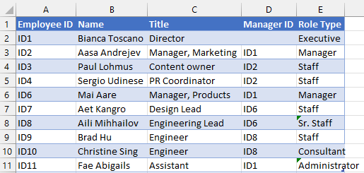
The key to understand are columns “Employee ID” and “Manager ID”. The Employee ID must be unique as it uniquely identifies the employee, and its corresponding Manager ID value should match the values in Employee ID column values as it defines the relationship of an employee node with another node with a different name. If the Manager ID is left blank for an employee, that places the employee at the very top of the organization.
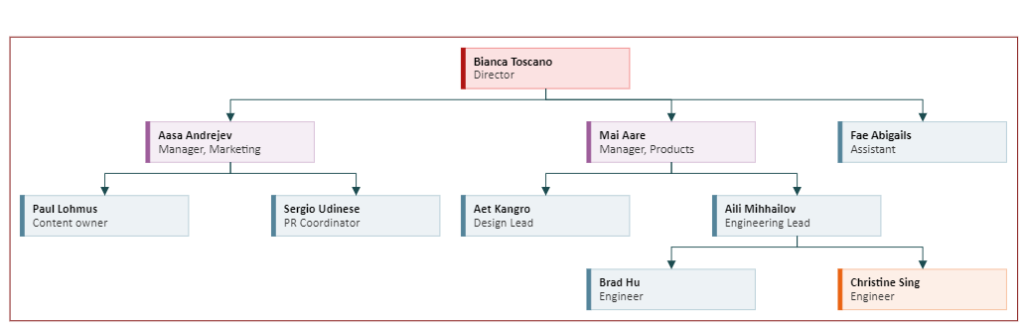
Here’s the output:
To change the dataset or data source that the chart is using, click on … button on the chart and choose Source table. That’ll highlight the current table used for the chart…you can modify it as needed but be sure to click Refresh button on the chart to update the chart accordingly.
Above, the table has been modified to add 2 more engineers under Aili Mihhailov (Engineering Lead).
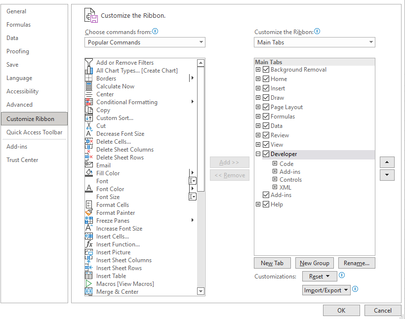
* The Developer tab in Excel is hidden by default. To make it available: Go to the File tab and select Options and click on Customize Ribbon. Then, go to the Main tabs box under customize the ribbon and check the Developer box. (see image)
Another way to create the chart is using Office SmartArt feature built into Excel. This following is created by SmartArt (Insert->SmartArt: Hierarchy: “Name and Title Organization Chart” ). Then manually typed in the names and titles from the table as reference. To format, select each node and change the font as needed from Home ribbon.

▛Interested in creating programmable, cool electronic gadgets? Give my newest book on Arduino a try: Hello Arduino!
▟