This is Part 2 of the series “Network graphs explained with scenarios“. Please read Part 1 first for proper continuity.
A few of the scenarios I cover in this blog series here:
Project scheduling example – Shows how to compute critical path on a network of related tasks. Covered in Part 1.
Routing example – Shows how to create and draw a network graph with weighted edges. Computes shortest, longest paths, degrees, and more (using Dijkstra, DAG, BellmanFord, and Jin Yen’s algorithms). Covered in Part 1.
Social network example – Creates and draws a sample social network. Covered here in Part 2.
Family “tree” example – Shows how to create a relationship graph with color-codes and more. Covered here in Part 2.
Each scenario is briefly explained below.
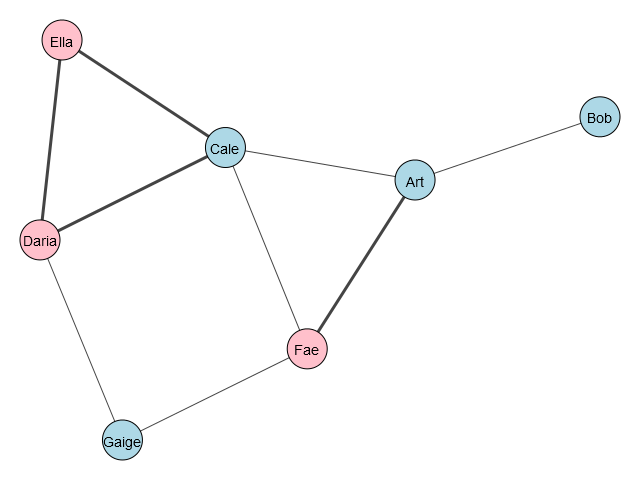
Social network example:
Assume that we want to store names, ages and genders of people in a social network as node/vertex attributes, and for every connection (edge), we want to store whether this is an relative tie or a non-relative/friendly tie (True if relative, False if friends only).
The people in this story are: Art, Bob, Cale, Daria, Ella, Fae, Gaige aged 25, 31, 18, 47, 22, 23, 50 respectively. Their gender are m, m, m, f, f, f, m respectively (m: male, f: female).
Some are friends, some are related. Art and Fae are related. Ella, Daria and Cale are related. The rest are friends.
Objective: Draw the social network graph. Highlight the people who are related. Color-code the nodes by gender.
Solution: Every Graph object contains two special members called vs (vertices or nodes) and es (edges) in iGraph. The pairs of nodes specified in tuples are the connected nodes by an edge. In this case, the edge has no weights. However, I will use thicker edge lines between nodes who are related.
I’ll use iGraph library for this one. The code to create the graph is below:
import igraph as ig
g = ig.Graph([(0,1), (0,2), (2,3), (3,4), (4,2), (2,5), (5,0), (6,3), (5,6)])
g.vs["name"] = ["Art", "Bob", "Cale", "Daria", "Ella", "Fae", "Gaige"]
g.vs["age"] = [52, 31, 18, 47, 22, 23, 50]
g.vs["gender"] = ["m", "m", "m", "f", "f", "f", "m"]
g.es["related"] = [False, False, True, True, True, False, True, False, False]
Now, we can do all sorts of things with it! We can query the degrees of connections, retrieve any node’s information (by node ID or name) like age, gender, connections, types of connections, etc. We can even change the graph dynamically by adding/removing nodes, edges, and changing their ages, genders, connections. For this example, I won’t be doing all that for brevity. Instead, I want to next draw the graph on screen. To do that, we’ll use matplotlib as we used in Part 1.
I want to call out the tricks to color-code the nodes by gender and highlight the edges that connect related people. The code to do that is below:
color_dict = {"m": "lightblue", "f": "pink"}
visual_style = {}
visual_style["vertex_color"] = [color_dict[gender] for gender in g.vs["gender"]]
visual_style["edge_width"] = [1 + 2 * int(related) for related in g.es["related"]]
visual_style = {}
visual_style["vertex_color"] = [color_dict[gender] for gender in g.vs["gender"]]
visual_style["edge_width"] = [1 + 2 * int(related) for related in g.es["related"]]
I’m creating a dictionary of colors which is then applied to the entire graph conditionally. Similarly, the edge line width is conditionally doubled when the edge is connecting two nodes that are related (remember above that we added the attribute “related” and set it to True (for related) and False (for friends).
The graph is created as below:
Family Tree example:
This is a more complicated version of the social network example in the sense that we have more complex dependencies. Here’s this family’s story…
Harry has two sons from his previous marriage: Cale, Gaige. Mary has a son Bob from her previous marriage. Harry and Mary happened to meet and fall in love. They marry each other. Together, they have a daughter named Ella.
Objective: Draw the entire family dynamics as a graph showing different relationships (color-coded) and all connections among all individuals.
Solution: I’ll use iGraph again here as I don’t need the weighted edges. I need several attributes associated with the nodes. To summarize the dynamics, let’s recap:
Harry: Husband. Mary: Wife.
Cale, Gaige: Harry’s bio-sons.
Bob: Mary’s bio-son, Harry’s stepson.
Ella: Harry+Mary’s bio-daughter.
Cale, Gaige and Ella are blood siblings (same father).
Bob, Ella are blood siblings (same mother)
Bob, Gaige, Cale are step-siblings (Cale, Gaige have same father and different mother from Bob’s. Bob has different father from anyone else, same mother as Ella’s)
I create the graph with nodes and edges as below:
g = ig.Graph([(0,1), (0,2), (0,3), (0,4), (0,5), (4,5), (4,3), (4,2), (4,1), (1,2), (2,3), (3,5), (5,1), (5,2), (3,1)]) Next, if I code the relationships on edges, I can assign the edge some values such as: 0…4. Where 0 means the edge is for spouses, 1 means biological child-parent, 2: siblings, 3: step-siblings, 4: stepchild-parent. The following code accomplishes that with my custom “relation” attribute:
g.es["relation"] = [1, 1, 1, 0, 4, 1, 1, 4, 4, 2, 2, 2, 3, 3, 2]Greate, next I want to also show the parents (Harry and Mary) as larger nodes and in more intense colors. To do that, I use the same dictionary trick as above to map them. Except, in addition to “m”, “f” for everyone, I chose to encode Harry with “mm” and Mary with “ff” to indicate Father and Mother! That way, I can achieve the visual by the code below:
node_size_dict = {"m": 40, "f": 40, "mm": 60, "ff": 60}
visual_style["vertex_size"] = [node_size_dict[gender] for gender in g.vs["gender"]]
The coloring is done similarly with the following technique. So, Harry and Mary get special, intense colors, while the rest of them will be colored as lighter shade of blue (for males), and light pinkish (for female).
color_dict = {"m": "lightblue", "f": "plum", "mm": "dodger blue", "ff": "magenta"}
visual_style["vertex_color"] = [color_dict[gender] for gender in g.vs["gender"]]
Great, now I need to draw the edges with specific colors. For example, I already encoded the relationships above, so I need to correspond some colors to those codes using another dictionary as shown below:
# if 0/spouse, edge color should be black. If 1/child-parent (biological), set edge color to blue.
# if 2/sbilings (same parent), set edge color to green. If 3/step-siblings, set edge color to purple
# if 4/step-child, set edge color to gray.
edge_color_dict = {0: "black", 1: "blue", 2:"green", 3:"purple", 4:"gray"}
visual_style["edge_color"] = [edge_color_dict[relation] for relation in g.es["relation"]] 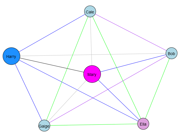
Perfect! The graph output is shown above. We can easily see that Gaige amnd Cale are step-sons of Mary, while Ella and Bob are her biological children, and so on.
I hope it was interesting for you to read how to create different types of graphs programmatically to represent real-life scenarios. This is not a tutorial on Python or programming, rather sharing concepts and applications. If you’re interested, there’s a plethora of resources online and offline (books) to learn programming, Python, etc. I have provided links in Part 1 and Part 2 of this series to the libraries used. There are some tricky caveats to getting the graphs to draw on Windows (as the Open Source libraries and Python community are first geared toward Linux and then Mac) but after some research, I was able to get them to work, especially iGraph. I won’t go into detail here, but Windows users will need to also install cairocffi package and Windows run-time components configured very specifically…however, that’s outside the scope of this post. I’ll leave rest of the learnings up to you.
▛
Interested in creating programmable, cool electronic gadgets? Give my newest book on Arduino a try: Hello Arduino!