Trend analysis is a pivotal part of business analytics, project planning, marketing, and virtually all aspects of strategic planning and understanding of patterns/behavior. In this post, I present a straight-forward but very practical use of some analytics and walk you through: 1) Data collection 2) Data cleanup and shaping 3) Creating trends and understanding the patterns and finally 4) Learnings or key takeaways.
The scenario:
I want to know consumer behavior or specifcially interest in movies (any movie) and if that has any correlation to time. In tactical terms, I need to get some time-series data and see if I see any patterns in that dataset. Specifically, I’m interested in a) What is the seasonal pattern (if any) when viewers are most interested in movies b) On which days are viewers most interested in movies during the year?
Data collection:
I started with Google Trends dataset and scoped it to only United States that’s publicly available, and downloaded the csv data on search term “movies” covering January 2021 through Jan 2022 (to-date. At the time of collection, we’re still in the first week of Jan, so we’ll stop there).
The dataset contains 2 simple columns: Date (in format: mm/dd/yyyy) and a value for “interest” (int). After perusing the data, I noticed that the first several months’ data points were collected weekly until Nov 28, 2021, following which they were collected daily. For some reason, Google used to track them weekly but then turned to daily. But no worries, that’s not going to mess up her analysis as long as we know what we’re dealing with. It’s important to understand though that the 2nd column (“interest”) contains where 100 is the peak popularity for the term; 50 means that the term is half as popular; 0 means there was not enough data for this term….THEY ARE NOT THE RAW NUMBER OF SEARCHES!
Data cleanup:
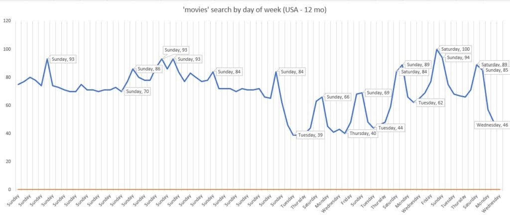
Next, I would also like to know not just the patterns by months, but also by day of the week. So I can answer the question: On which days are viewers most interested in or curious about movies?
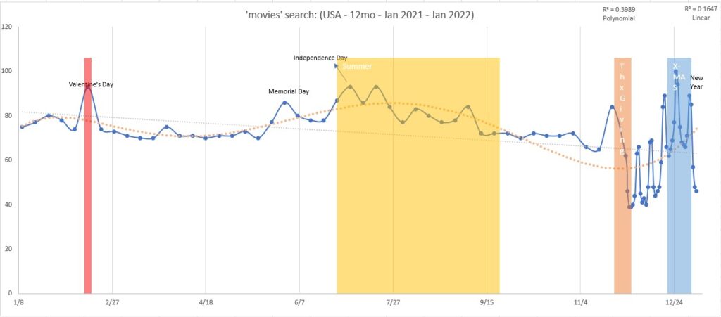
First, I created a line chart with the time (months and days) in the x-axis and count of searches along y (chart 1). Then I created a similar chart but instead of dates, I use the names of the weekdays extracted from the simple data using CHOOSE(WEEKDAY()) nested formula such that we have the usual names such as “Sunday”, “Monday”…etc.
It quick became clear that when we look at the peaks and valleys, there is indeed an interesting (although I expected it) pattern. We can see peaks of movie searches around Valentine’s day, summer, and holidays. See chart 1.
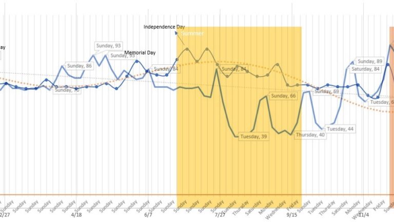
In the chart 2, we also see the peaks and valleys with a blend of seasonal as well as day of the week factored in. If we place chart 1 and chart 2 on top of one another, you can easily align the weekday with the seasonal trends and it starts to make complete sense! See chart 3 below.
Data Visualization:

Trends and Projections with Statistics:
Visually, the pattern is already clear. But to do projections we need to quantify the pattern and also understand the significance of the trends. The most general way to do this is to use a Linear Regression formula on time-series data. Which I did and it’s shown as a dotted light-gray line in chart 1. However, it’s not telling the story very accurately. It basically is telling us that the searches start out high in January of every year and taper off since into December throughout the year. We can see that’s not the truth. The truth is it is seasonal and fluctuates quite a bit, in a pattern but not necessarily at a fixed interval. So, I calculate the R2 value for that to see the strength of the relationship between movie searches and month. It turns out to be 0.164. Okay, not very strong but I want to compare it with some other R2 to see which is a better fit.
So, next I used Polynomial Regression model and using the maximum number of order, I see a nice ebb and flow which seems much more nicely with the peaks and valleys! It’s shown as orange dotted curved line. If I calculate the R2 for that, it comes out to be: 0.399. This is a much better fit than the linear model!
I have marked the interesting periods in the chart with colored areas and callouts in both chart 1 and chart 2, and chart 3 of course shows them all overlaid for giving us a sense of repeating week days’ trends throughout the entire year!
KEY TAKEAWAYS
Interest in movies throughout the year:
Interest in movies start to pick up around Valentine’s day and then drops off.
Next peak is Memorial Day, Independence day, and generally stays up through the summer and starts to taper off starting fall. It picks up again around Thanksgiving and takes a nose-dive until the holiday periods as we approach Christmas and New year holiday period.
Christmas Day is the day of MOST interest in movies in the USA.
The lowest amount of interests are right after the holiday peaks: After Thanksgiving and after Christmas + New Year holidays.
Interest by day of the week:
Consistently, throughout the year, the searches for movies are highest around the weekends (Saturdays, and Sundays being the top). Although one would think Friday nights would be also near the top, they aren’t…probably because most Americans “go out” instead of watching movies at home, therefore fewer searches for movies to watch.
Together, these patterns clearly show the viewership behavior in the USA, and offers a clear picture as to when is the best or worst times to release a movie for most viewership.
Hope you found this interesting!
▛Interested in creating programmable, cool electronic gadgets? Give my newest book on Arduino a try: Hello Arduino!