In this post, I’ll walk through the steps starting with a raw dataset that’s organized differently from what I need, to reshaping the data using Excel formulas, and creating an interactive visualization using PowerBI, to publishing it online using PowerBI. Excel and PowerBI work hand-in-hand to solve such problems effectively, and efficiently.
First, I’ll start with FBI crime data for 2018, 2019 by large cities of each state which I obtained from: https://ucr.fbi.gov/crime-in-the-u.s/
The Excel sheet format downloaded from there is as below:
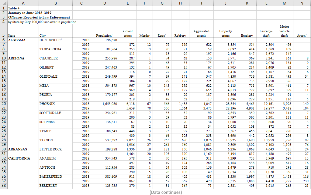
As you see, the data is arranged by State, and then alphabetically by cities in the state…in which the years can appear in any order. The population is of the cities, and not states.
What I want to do is: Show violent crimes, murders (they separated murders from violent crime) and property crimes by State, and by Year…only for top 5 most populous states.
That means, I’ll need to aggregate the population of cities for each state in original dataset, then group their data by state, then combine the state’s cities stats on selected crime categories. NOTE: This is not necessarily the population of the State, rather sum of population of cities where crimes were recorded in the data provided.
Next, for each state, I want only the population, and selected crime types per year. Total for 2019 in one row, 2018 in another per state (combined of all its cities in original data). This is done by: =SUMIF() in Excel.
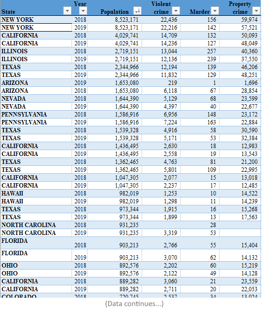
Once I have totals in each state’s tab, I combine the sheets into one table. The table below now contains only the crime types I’m interested in showing, and ALL the states and their total population, and total crimes per category, per year. However, we still have states repeating and spread all over the table!
Next, I want to extract only a selected few states from it…the top 5 most populous states’ data across all years. So, using FILTER() and another SUMIF(), I can get each state’s info into a new table. Below is what it looks like for CA state for example:
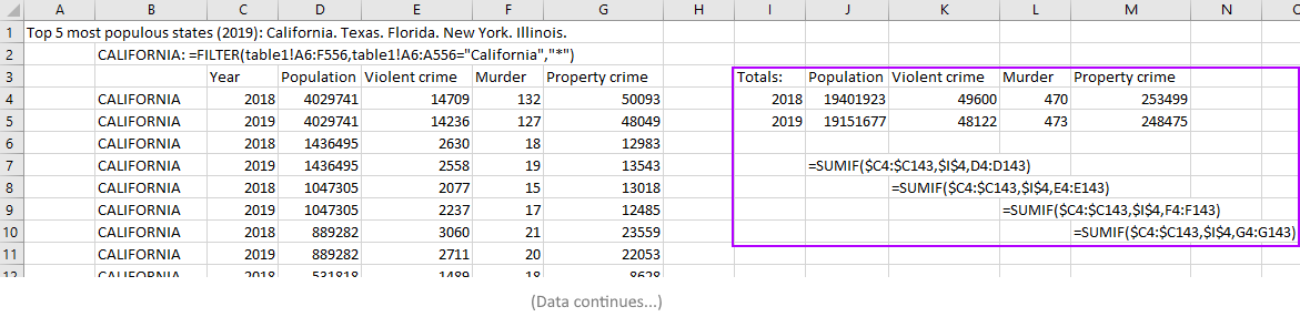
Now we have all desired data PER state in one place. But notice that year still repeats and spread all over the place. We need a summary by Year!
The highlighted box in the image above shows the calculation to get each type of crime stats, per year! It basically says: Look in year column, and only if it’s 2018, get its values for Population field, sum it up and give it to me. Then do it for Violent crime, then same for Murder, Property crime fields. Then do it for year 2019. Then do this for the remaining states (TX, FL, NY, IL).
To make the visualization exercise more interesting I added years 2012 to 2017 by ‘simulation’ (2018, 2019 are actual FBI data) so the Play will be more interesting (we will see below). I generated those numbers by picking a random number between max and min crime rates for 2018-2019 for that particular state and fill the missing years. (For actual prediction, I’d do it differently using more statistical methods but that’s a different scenario…for this exercise, the point is to show appropriate data arrangement from a different data shape, and creation of an impactful visualization.)
The combined, re-shaped data table now looks like this:
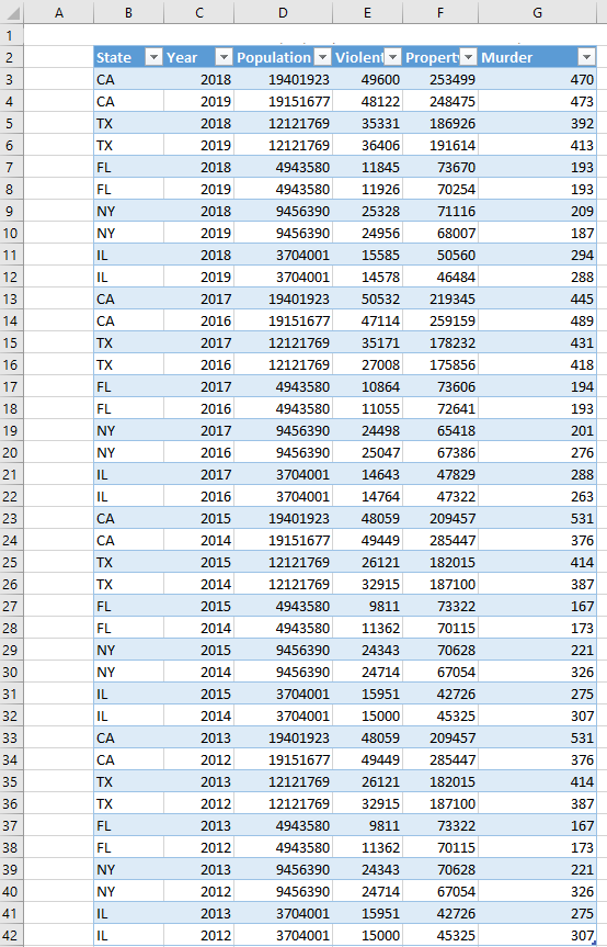
Now we have States and totals for each crime type summarized neatly by year. We still have states repeating but only because there are multiple years! Each state is uniquely summarizing its record for a particular year…and that’s where we want to be!
We are ready to create a chart or visualization where we can see each state’s data at any given year within the time-range. As well as, pick any particular year to see all stats for all selected states.
For visualization, an interactive scatter chart, specifically a bubble chart would be useful. Each bubble will denote a state. The size of each bubble will depict the population of each. Bigger bubble means larger sample population and the sizes are relative to other bubbles.
One axis will show one type of crime (e.g. Violent), another will show another type (e.g. Property). Since, I also want to show Murder, I can achieve that by showing that metric in a Tooltip! Then I want to draw a line right on the plot to show the Mean amount of each crime rate for reference: one for violent crime, one for property crime.
I have used PowerBI…it can be done in Excel as well, however, for animated Play of the chart, PowerBI is the way to go as Excel has deprecated its support for Power View animated charts. The complete visualization is shown below:
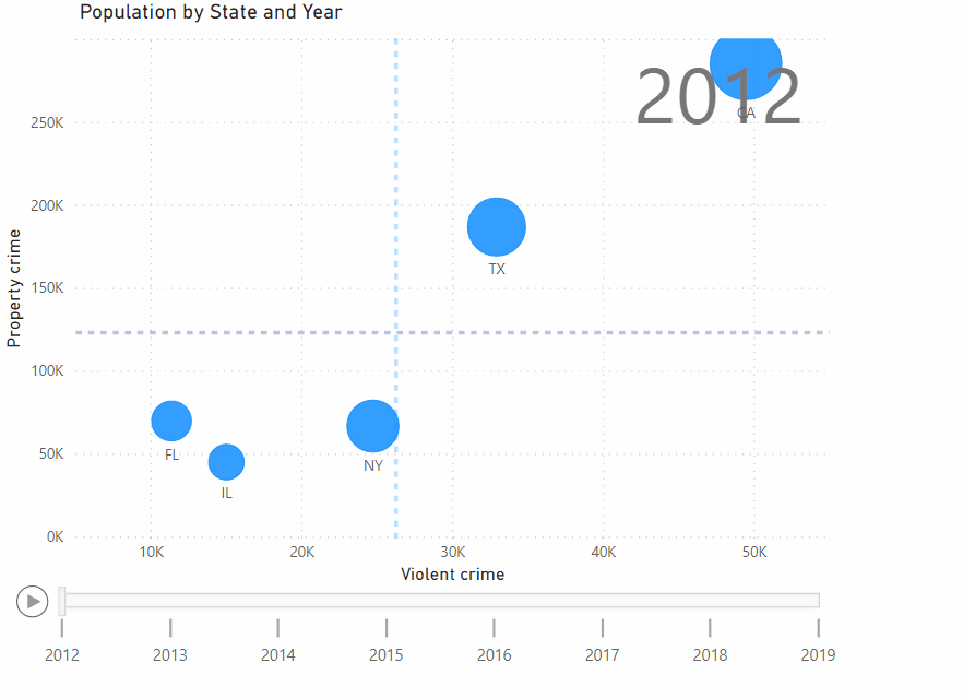
As you can see, there’s a Play and Pause button to show the data points move from start to end of the dataset. We can pause or pick on any particular year and see all data for that year. As we hover the mouse over any bubble (which is a state), it’ll show complete stats including the Murder rate for the given point in time.
The overall Mean (based on these 5 states, from 2012-2019) of Violent crimes is shown vertically (light blue dashed line), and the Mean of Property crimes is shown horizontally (light purple dashed line)…they give us helpful reference points.
I hope this walk-through was interesting. The chart is also published online here. Unfortunately, PowerBI team decided to put restrictions recently which means: 1) You have to sign in to view it or 2) The author needs to have a PowerBI Pro (paid version) to be able to share with non-PowerBI users. I used the free version. At least, you can create a free account to view it live (and interact with the chart) at powerbi.com if you wish. At any rate, for additional info, please see the footer below.
This post is not meant to be a formal tutorial, instead it is to offer key concepts, and approaches to problem-solving. Basic->Intermediate technical/coding knowledge is assumed.
If you like more info or source file to learn/use, or need more basic assistance, you may contact me at tanman1129 at hotmail dot com. To support this voluntary effort, you can donate via Paypal from the button in my Home page, or become a Patron via my Patreon site. A supporter/patron gets direct answers on any of my blogs including code/data/source files whenever possible. At the very least, it’ll encourage me to share more posts/tips/knowledge in the future.