A violin plot is a visual that traditionally combines a box plot and a kernel density plot. This is typically created in R, Python languages using MATPLOTLIB and other applications/modules. However, I show here how to get it done using only PowerBI.
About Violin Plots
Before I go into how to plot it, let’s understand how to read it. Yes, it’s pretty but it packs tons of important information…if you turn it clock-wise 90 degrees, it’s a smoothed Histogram! Additionally, it shows all the Box & Whisker plot information (median, mean, range, quartiles)…however, unlike a box plot it allows you to see multiple peaks clearly. While a box plot lets you see basic distribution information about your data it doesn’t show you how your data looks throughout its range. If you have a multi-modal distribution or complicated clustering of data, a violin plot will expose that information also.
A kernel density plot shows variations in your data across its distribution. It works like a histogram, but as I stated earlier, it uses kernel smoothing to provide a smoother curve where noise might otherwise be present.
Huge thanks to Daniel Marsh-Patrick for creating add-in for PowerBI! His visual widget provides you with the ability to make these violin plots, with the option of displaying an accompanying combo plot (either a box plot or a barcode plot).
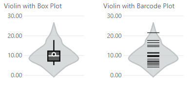
In the sample images above the box plot illustrates:
- The range betwen the first and third quartiles (box)
- Median (white line)
- Mean (white circle)
- 5% and 95% confidence ranges (whiskers)
The barcode plot shows the individual data points rather than a summary of their distribution. The shape around the combo plot represents the kernel density plot and shows that the majority of our data is clustered around or below the median.
Creating My Violin Plots
I used PowerBI Desktop 64bit (Windows version). Here’s a brief summary of how to plot them…
- Get the right visualization app from AppSource in PowerBI. From PowerBI desktop, Home ribbon, then More Visuals > From AppSource (Search for “violin plot”)
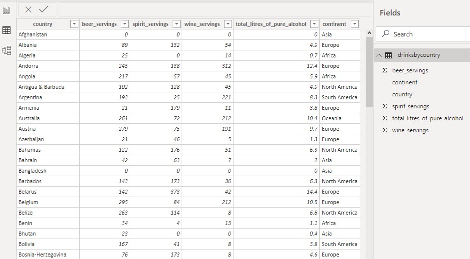
- Get the data. e.g. from Web: http://bit.ly/drinksbycountry — drinksbycountry table will appear in avaiable tables. (This is just a free data of beer and wine consumption by countries and their continents.)
- Start a new page, and add the Violin visual widget. (Once installed, it’ll appear in the Visualizations canvas.)
- Select it and select the fields from drinksbycountry table (e.g. category=continent, measure= beer_servings, sampling=total_litres…)
After importing the data, my table looks like this:
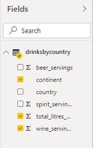
Regarding step 4, here are my available fields:
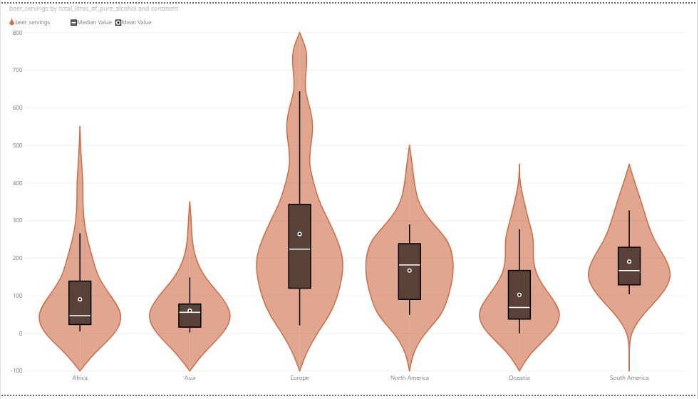
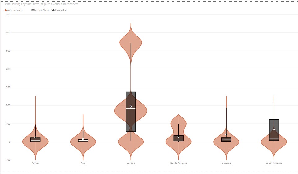
Here are the results (I did one for beer, another for wine) and they’re as beautiful as they’re informative: